Showing posts with label color. Show all posts

Monday, November 23, 2015

Happy Medium

There is no bigger evil in the world of the over achieving, insta-go-getting, facebook high rollers, than the word m-e-d-i-u-m. It's this stuck in the middle, static, neither here nor there option in life. It's not the cream of the crop, or the lowest of the low. A mentality of 'I'd rather miserably fail than be defined as mediocre'. No wonder there is the known phenomena of the "mid-life crisis". There is no sex appeal in middle. 


The pink logo creates a surprise in a 
well balanced space 
Or is there? 

It seems that humans have developed this odd, almost counter intuitive knack, to push boundaries, which is completely against any natural instinct. Nature always wishes to balance, to reach equilibrium. We as humans want for some unknown reason to defy that force of nature. We sleep less than we need to, we eat more than we should, we work longer hours, and in general don't really take very good care of ourselves and our environments. 

As a designer I like to keep things off balance, surprise the user of the space. I'll use bold colors where you won't necessary expect them. I'll align certain things that will keep you on your toes. But it's a delicate process that can't be done on a whim. These mis-alignments can only be done right when you have a balanced and clear idea, and when there is a solid anchor you can play off of. Otherwise it creates clutter, uneasiness and in general a feeling things were not thought out properly. So there is, you see, a certain method to the design madness. 

That is why a Happy Medium is one of the most critical things in our daily lives, and is one
of the hardest things to come by. (Ask any GC trying to level floors inside old homes). We need the temperature of the HVAC to be almost exactly the same in our work environments. Lighting and its brightness need to be precise. The height of our kitchen countertops is meticulously measured. 
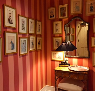
The seemingly cluttered and uneven photo alignment is 
made possible due the well balanced and centered table
& mirror. 
The length and height of stair risers. All of which are meticulous averages, which years of usage in the world have managed to come by. These "lowly" mediums are the anchors of our day to day life, the blocks from which we are allowed to soar to different places. In my view "Average" should be proclaimed as a new goal, a place we all should aspire to reach, a balance that redefines our center lines, and alignments. A Happy Medium. 


Monday, March 23, 2015

Design as a Universal Language

At one of my first reviews at MassArt  the first comment I got was, why did I pin-up my process the wrong way. You see I'm a native Hebrew speaker, I write from right to left, my starting point is the end of your process - or is it? My mother tongue is English so right away I knew what my reviewer had meant, and it made me smile.

I came to think about that review after listening this week to a great talk by Oded Ezer . Aside from the mind blowing approach to typography, what was intriguing to me was the fact many of the examples Ezer brought were in Hebrew. At first, this was unsettling to me, the instinct being to try and translate it to the Americans in the audience. But once that feeling subsided what I came to realize was how amazing it was that we as humans can communicate through design regardless of what language we speak. If you ever picked up a design magazine in a foreign language, you'd still get the gist of it.

Design works with some of the most basic, and universal foundations, balance, color, light, texture. It is a powerful tool that at the wrong hands can be used to oppress people, as it was used in countries under the communist regime. And yet achieving the right mix of these elements require a process of trail and error, a conversation of sorts between these elements.

Photo credit // Emily Neumann 
When something clicks in a space we "get it" feel happy and good. When something is wrong we feel uncomfortable and irritable (messy rooms are a good example). We owe it to ourselves to get better design around us, so we can become free of the visual assaults that create so much negative "noise" in spaces we use all the time.

Designers are translators of these basic elements into the world. Though universal the language of design is intricate, and like any other language requires rigorous practice. I doubt that you would solely trust business correspondence to Google translate, there is no reason why your office or home design be left at the hands of people without the proper language skills.

Monday, March 9, 2015

Color Splash*


As a designer nothing daunts me more then picking a color for my own home. I find it paralyzing, as if the color choice I make will reflect poorly on me, or worse off, on my design skills. My home is my portfolio, right? And have you ever seen how many choices there are out there? I assume most people feel like this when faced with the option of picking a color (well, minus “my home is my portfolio” bit). I’m hoping my technique for picking a color will make for an easier, less paralyzing process. I am, after all, a trained designer.
The first thing to think about is, what is color? That question can be answered in so many ways but I feel a talk I have heard from Beau Lotto sums it up in the most interesting way.
After defining what color is to you, try and make good use of all the furniture catalogs that are mailed to your home. Flip through them and mark off rooms that look like one of what you would define as you dream room. Take photos of color in spaces that you like: store fronts, restaurants, hotel lobbies, flower arrangements, in short any color that catches your eye. Then put these snippets in the space you wish to paint, I would print these out, color on a computer/smartphone screen will not reflect how the color will look like outside the virtual world.

At this point you basically narrowed down the color spectrum that appeals to you, and are ready to go to your local hardware store to look at some color fans. There are so many good companies around, but from experience in Massachusetts most contractors will lean towards using Benjamin Moore Paints I have used them in the past, and was pleased with their  huge selection and quality of paint. It mainly boils down to how much money you are willing to spend on a gallon of paint. In some cases the difference between paint companies would be in how vibrant the color is, how many coats of color will be need to be applied to get the desired color effect, and how fast the color will fade. Another thing to consider is how many toxic fumes are expelled while applying the color or what is called VOC , the use of lead based paint is illegal, I like going with the zero VOC paints. Lastly you’ll need to figure out what kind of finish you would like (or in layperson terms how shiny will the color look). Most walls in dry rooms (i.e. not your bathroom) will receive  an Eggshell finish, window trims, door frames, and baseboards will be in Satin.

Before buying gallons of paint get some samples painted on wall surfaces of the room. If you are painting a house, paint in different rooms to see how the color looks like. I have used one color in my own house that looks like 3-4 different shades, this depends on the time of day or amount of light that hits a certain wall. I urge you not to rush the process in order for you to truly understand what you like you need to train your eye and mind, these things take time.

Try using the same color batch, as there might be some slight variations of color, and you want to get the exact tone and shade of color in the room. 
Enjoy the process and play around with colors it’s one of the easiest and most impacting changes you can add to a room or house. And like the fickly weather in New England, if you don’t like the color – change it!

*This post was originally published 5/9/2012 <http://bostonrealestateblog.bushari.com/color-splash.htm>