Showing posts with label New England design. Show all posts

Monday, January 30, 2017

The culture of coffee and the lost art of human interaction

I miss it, I really do miss it.

That feeling of just dropping my bag on the ground, leaning back inside the chair, adjusting my sunglasses, and just asking for it -- "Small cappuccino please". A few minutes later, after I managed to take a deep breath, say hello to the person I walked in with, and the aroma filled cup lands at my table, with a side of a small butter cookie. No paper cups here, no lines to stand in while non communicating cell phone glaring humans surround me, no offensive cheap cleaning detergent smell, no dry or cold baked goods. Instead there are sounds of people talking over each other while glaring music surrounds them, the sound of actual spoons clinking on the sides of the cup, a sharp smell of fresh salad being chopped. A constant feeling of something in the air. 

This is not utopia, this place does not just exist in my mind, these coffee houses are commonly found in almost every main street sidewalk, shopping mall, beach, desert, and even some gas stations all around Israel. 

I dare say it is one of the biggest cultural shocks I refuse to adjust too (that, and being told I can get 'cash back'). That fleeting moment of known theater, sitting back, and being seen for a just a millisecond. It as almost as someone stopped time just for you and asked you without too many words "Are you ok?". 

The lost culture of cafe idling is strongly tied to the high demanding office culture. That has yet to make the shift. Most people are expected to be in their work stations by a certain time. The only mark of rebellion is if you are able to walk into the office holding a logoed paper cup -- it signals to all "look at me! I'm so efficient with my time I even managed to drive through and get this lukewarm black something". There is true effort being made to shift in the office coffee culture, by bringing in state of the art coffee machines, some places go as far as bringing in a personal barista crew to your office twice a month. But it's all very artificial. As you are having coffee with the same homogeneous group of self selected people, without the outside world touching you even for a moment.  

Cafes are human interaction sanctuaries.
 
In Europe cafes were the meeting junctions of many thinkers who could cross reference ideas between disciplines. They are a place where the construction worker, the foreigner, the business person, the tired parent, the young student, all walks of life -- can for a moment have eye contact, possible real human interaction -- if they would only be allowed that moment of 'being seen' and offloaded of this pseudo artificial atmosphere of the 'small, medium or large' paper cup battle hymn. That is not a human way to have coffee, it's as if we are race cars stopping for a pit stop.

In the bedouin culture, a culture of nomads who live in the scorching desert sands, the coffee ceremony is very intricate and particular. Three cups are poured. The first will be tasted by the host, showing the guest the coffee is safe, the second will be drank by the guest himself, and then a third cup will be poured to show hospitality, and allow the guest time to talk and feel safe without being rushed out. 

I really do miss it. 


Monday, December 12, 2016

We all need to Lobby-up

California Academy of Science in San Francisco, CA
Museums are a place of refuge, and possess an almost spiritual pause for me. From the swish of the huge glass doors, to sounds being hushed at the lobby, to the excitement of what journey my brain, mind and soul are to embark on. 

The sheer volume of people seen in museums (art, science, children), made me wonder what is it about the quality of these spaces that make us want to go into them, and maybe even sometimes see a decent exhibition. To further that question, I want to learn if it all it would be possible, to create these types, of seemingly straightforward functional spaces of interaction, and wayfinding, work in their shunned away cousin - the office building lobby -I mean we don't all run and feel happy in offices lobbies, break spaces, or their indoor courtyard cafes (as nice and as clean as they get). 

I have recently been to both big art museums and huge office lobbies and the difference in atmosphere and vibe was so striking to me. Yes you can claim that going to a museum is a mind set of sorts, a mini break from the realities of the world -- though some exhibitions could not bring you any more closer to reality The location of big museums is carefully selected, but this is also true to some downtown office buildings, and even in office parks outside the cities. 

Could it be the intention of why you walk into any of these spaces that makes the difference? 


Hudson Yard's Lobby New York City 
But as a visitor to both these spaces, the grounds for me going to any of them can be similarly exciting // functional -- meeting a new client, creating new connections, building a new space. All (in my view) happy productive things. Where is in museums I try to get inspired while stuck in a creative process (one could claim this might create heavier expectations from that space). And yet these office lobbies depress me to the core and weigh heavy on me. Something is not "right" in them. Most of them borrow from the large 12th century cathedral ceilings, that intend to make you feel small and meaningless. Even if there is a cafe it's a very dire soulless functional one, which only makes matters worse because the lobby area smells of old coffee and stale pastries. Usually the lighting and furniture picked out for these spaces are so "inoffensive" they lack any personaly, grace or function (who wants to sit in a smelly, cold uninviting space). So many more people walk into these office lobby spaces, than to museums. I can't even imagine how they feel going in and out of these places day in and day out of their work week. 

It's not just about the reason or intention you walk with into these spaces, it is the intention (or lack of) whoever built these buildings. An office lobby is just a museum lobby without soul -- and that is the key difference. People want to feel connected, they want to feel someone has put some attention to their wellbeing. It all starts with a meaningful design process that is not just function driven. Yes it means digging deeper, but the effort will pay off in happier more content people in the work space -- and there are more people working in offices than going into museums. 

Monday, September 12, 2016

Something in the Way

Life gets in the way. It does. So many times I wish for a bubble to be able to think, or at least manage to put 2 and 2 together, without it becoming 5. 

But then again this bubble utopia I wish and long for does not truly exist, even if it did -- would it make it easier to work in this uninterrupted world? I find that in most cases though, as a tell my active 7y, silence is golden, it's sometimes (ok most times) paralyzing. That the "noise" generated by the things around me, hold in them the true grain of creativity. When I'm presented with a "blank" canvas space, where there is nothing to bounces off thoughts from, is when it really gets tricky. 

The challenge is, most commerical spaces are like that, blank, nothing bouncing off right at me. Which is hard, very hard to come up with a narrative or meaning, if you will, for these spaces. So how does one marry love, passion, and creativity into spaces that obviously need the most attention? It becomes a journey of looking into how to amplify some of the hidden "noises", create meaning.

The average American office interior spaces and their design are almost always neglected, and over the years they have been left at the hands of cost per SQFT demands, business cooperations, market trends, real estate forces, furniture manufacturers, and various management theories - but almost never at the hands of the end user - the "average" office worker.
In his book “The European office” Juriaan van Meel proclaims “Office buildings (...) are perhaps the most important building types of the 20th century… They dominate the contemporary city and accommodate more than half the working population in the Western world”.
That to me is mind blowing information - more than half of the working population in the Western world!!! Which on average spend 47 hours a week in these buildings, which is more hours spent sleeping a week, or almost three times more hours spent with immediate family. 

So whenever I walk into a blank space, I keep that piece of information in the back of my mind, because so much time spent in such neglected spaces affect not only the person using them, but society as a whole, it should get in the way, because life gets in the way. 

Monday, November 9, 2015

Design on the Run

The other night as I meticulously laid out my pre-race paraphernalia on the dinning room table, a familiar sensation hit me. It felt like the night before a final review or a big client presentation. 

A festive almost religious like rhythm and movement comes to mind. Picking out the right running clothes, the socks, the race number, the power gels, the good luck charms, uploading the right playlist. 
Until running my fourth big run, I never realized how much the design process and long distance running have in common. 


Pre-race layout
I always worked while listening to music, a beat to which I would carefully glue the model pieces in their right place, or hand draw the envisioned elevations. When I look at past work, I will always know which tune I was listening to at that time. Every race I go to I have a playlist ready for the rhythm needed for that part of the run, the warm up music will be different than the one for running up that very long hill. Design projects will have the same process of warming up (brainstorming, sketching, etc.), the long and tedious main course of the run (building, permits, fixing mistakes), and finally the dash to the finish line. 

Long distance running requires training and careful planning. Good design does too. I miss having that process followed to a T. The haphazard approach people have to the design process creates for a lot of contention and costly mistakes. It's almost akin to a 5K runner suddenly asked to run the Boston Marathon over night. The damage that can happen to the runner is clear. The same is true for the design process, there is a careful methodology to it, and when short cuts are made in that process, spaces seem incomplete or just don't look or feel right. 

The most successful, and rewarding projects I have been a part of, are the ones when I'm allowed in on the 'warm up' phase. From the point of helping decide which space will work better for a new office, and its growing team; to running up the hills of painful budget decision making, and exciting new spatial moments, which in my heart I know will make for the best working environment for that team. 

Office kitchen lounge in the making 
And like with running, going all the way up to the finish line, when every fiber of my being is dead-on focused on getting it done right and on time, (the counter top edges should be mitered, the layout of the flooring, and the thermostat should not be in the middle of the feature wall...) one foot after the other. 

Monday, October 26, 2015

One for the team!

Last week I happened to listen to a piece on the radio about the decline of team sports in America. As a mother of 3 kids, 2 of which are part of team sports, it got my attention. Aside from all the back and forth about costs, lack of interest of the kids, helicopter parenting, etc. It got me thinking that in fact there might be a greater issue at hand, something that I worry about. I fear that there is a 'flattening' of our society to what the Blue Man Group calls the 2 and 1/2 dimension.
 
As a society at this point I find we lack rigor and will to make that extra effort. Most of us will admit we do not wish to spend the effort or time driving kids to god forsaken places to get ice-time or pool time, it requires effort, planning ahead, and yes dealing with an uncomfortable option your kid may lose. We want things to be happy, crisp, clean and so very easy, which is kind of like flat coke. 

This lack of rigor, commitment and effort hold true in many fields nowadays, the one in particular I'm concerned about is the area of design. Things look very easy on HGTV and it's off shoots, places like communal painter spots which allow us all to be Picasso for a night, easy measuring apps, 9 minute pasta dishes, easy 1 click furniture shopping, you name it. We are all short for time and by way of that we forget to stop and dig deeper into things, investigate them a little, expand our knowledge, and do some of the 'dirty' redundant work that is required. 
About 6 years ago, the Tate Modern in London held a special exhibition to celebrate the 10th year anniversary of its building. I have an affinity to this building, and greatly admire the Swiss architects, Herzog De Meuron who designed it. So my disappointment when I saw the turbine hall exhibitors, was huge. Here there was a once in a life time opportunity to articulate a thoughtful artistic display, and what it ended up being was a sad display of our declining culture. The exhibitors themselves were busy on their phones/computers "connecting" via social media. They forgot to connect their display to the building or the viewers who came to experience it, it felt haphazard, and not very well put together. 

But why do these things rub me the wrong way so much? Is there a connection between the lack of rigor and discipline to poor design choices? Maybe yes, maybe no. What I do know though is that good design requires attention to details not only to plans, flashy 3D models, but also to people and their behavior, culture and language. Good design can be full of humor and thoughtful when there is an investment in liberal arts and history education, not just when it comes from a DIY kit. 

Design is a language and as one who is bilingual, and studied a third - I can earnestly say that is requires rigor, and hard work, skills that in essence can be learned while doing team sports. 

Tuesday, October 20, 2015

No Name *

Branding // 
(as noun branding) The promotion of a particular product or company by means of advertising and distinctive design
Seems like everywhere you turn around these days one is expected to brand themselves, their work place, their product, you name it. That elusive quality that will distinguish them ahead of the pack, any pack. Starts from your web site landing page, Facebook page, twitter account, tumbler feed - you name it, you'll need to brand it. Better yet tie it all into THE brand. 

But you see good branding is hard to achieve these days, it requires something most of us don't possess - patience. In this fast track world of FB, snap-chat, insta tumbling sound bites it seems that no one is free from creating their own brand. A "brand" represents quality, identity, a vision of sorts if you will. Maintaining ones brand has become such an important asset, because we live in such a fast paced #imoutofthegame world. This branding process so precisely captured in Ecclesiastes (7:1)  'A good name is better than precious ointment' . 


A good brand will be created over time. This is where it gets tricky, especially, in the world of start-up companies who are by definition are required to move in an almost counterintuitive way of branding - most are required to break/invent a mold while maintaining a facade of 'respectability' as they are accounted for the funding they have recently secured.
Now imagine what it is to design these spaces? Where the unknown needs to be translated into literally brick and mortar. Where there is no clear brand or identity, yet the one thing that is expected, aside from keeping it all within a tight budget, is creating a space that will represent the company and the brand it hopes to stand for. It's a huge privilege and responsibility to be part of that process.


Monday, July 6, 2015

A moment in Time


This past weekend marked the 239th year of America, it was my 38th birthday. Usually around ones birthday, passing of time becomes more tangible, almost felt as another dimension or being. 

Time is a tricky element, though quantifiable by objective measures like seconds, minutes, days, it can also become very subjective when you feel that time flies when you are having fun, or that last minute of running that seems move so very slow. 

If you ever walked into a a retail store you would notice that there are no clocks to be seen, so as not to rush you. This unlike train stations where they can be seen all around. Classrooms have clocks on the walls, maybe they should be taken away so kids don't feel like time in school drags on for-EVER. My personal favorite is the one on airplane screens making me appreciate every second of turbulence. 

In design the role of time becomes like another element, from the "look and feel" of contemporary pieces or antiques, to the sense of timing in the space. How long it takes you to get from point A to B in a space can be crucial when many users need to use it. Emergency rooms are a great example of how lack of thought about the timing of receiving the patient can be the difference between life or death. Carefully monitoring the time cars are stuck in a traffic jam can make all the difference of air quality during certain times of the day. 


But there are also places where the design calls on you to pause and enjoy, thus creating a moment in time. It could be art work placed at a certain position, a change in flooring that will make you slow down and create a different rhythm to your stride. The ones I like the most are of carefully placed seats, allowing for a full stop in time to enjoy what is around you. 

Monday, June 15, 2015

Why Design Matters


MFA exhibit  a visual story of culture through design
I once got into a heated argument about an author, and his choice to write, what can be described as easy summer reading. His books are good, fast paced and huge crowd pleasers, but something lacks in his writing. The way I see it is, a well educated man decided to take all his knowledge, along side his linguistic skills, and serve the most diluted form of these to his readers. Till this day any form of diluted creation rubs me a little the wrong way.

Recently a big phone manufacture came out with an "all-you-can-think-off" watch. Aside from the technological aspects, again I had that uneasy feeling of something lacking. It felt that even though probably a lot of hours had been spent on making this watch, the intricate history of watch manufacturing and design was sidelined and somewhat ignored. The watch who has come out of a ground breaking company that holds steady at the front of the design world, feels like the diluted from of all of these. In fact most of the wearable technology lack in the departments of creativity and design, or are just plain ugly, geared mainly to a specific target audience, but we now know they won't be the only ones wearing these.

Why am I getting so worked up about this? As a designer I feel we all carry some visual and culture responsibly for our surroundings, especially ground breaking manufactures. If a manufacture that size comes out with a device that is so plain looking so far removed from the look and feel of a well crafted watch, the rest will follow that same diluted down version of a watch. Which in turn leaves us with design reductionism all around us. Same as the famous google landing page that has dictated a certain "look and feel" for web interface, these new wearable devices create a visually dull environment.

So what? you say. But in an era where never before again people around the world across any social-economic background have access to mobile phones, wearable devices, and easy read books, our culture and history gets diluted. As people with access to higher education it is our responsibility to demand higher design be available for all, further democratizing access to good design, which tells the story of cultures and the history of people in a visually cohesive and responsible manner. I refuse to live in a world of shrunk down versions of rectangles on my wrist or of bleak looking landing pages, I don't want it to define the rich culture I come from, I don't want my kids to grow up in a diluted version of the world.

Monday, June 8, 2015

Location, Location, Location!

Photo by Udi Edni, 48 Photography
The famous idiom of Location, Location, Location which is favorably used by neighborhood realtors, seems to feel almost dated when deciding on a new office location. In a world of quick and easy means of "off site" communications, the appeal of renting an office in a more cost effective area has never been more appealing. Or so we think.

In the past few years I have been privileged to personally follow and assist some companies through their "growing pains" of locating and designing an office.

Like a home, the office has a soul, and its location matters. Unlike a home, the economic ramification of poor office locations can be devastating for a new up and coming business, and for other local businesses around them. Office buildings are like mini-cities, they not only generate work or a certain kind of culture to the people who work in them, but also to the their surroundings.
If ever there was an example for a business creating a distinct culture around them, the first one that comes to my mind is Detroit. Though we know the outcome of the lack of foresight and mismanagement of Detroit, I think you can see my point of what a company culture can do to its surrounding environment.

Photo credit Emily Neumann
But not every employer or company have the privilege of finding that sweet spot between, easy commute, free parking, proximity to recruiting talent, and great eating spots. These are the exception, rather than the norm. This is where good design comes to play.

I can't stress enough how the American office space design lags behind it's European, Asian and Middle Eastern counterparts. It seems that many a times the functionally, cost effectiveness and connivence combined with a sever dose of conservatism have created the most dire and beige spaces I have had to work with. In his book "From Bauhaus to Our House" Tom Wolfe so pungently describes the 8' ceilings in steel and glass frames with 2' X 2' acoustic tiles, and buzzing florescent lights, that I had a vision, not of a luxury corner office, but of a prison cell. The design culture of offices has to change to allow for growth, where beige cubical walls are present creativity is stifled. Good office design has been proven to promote productivity, which in turn allows for companies to grow and create better environments around them outside the office building.

Monday, June 1, 2015

Identity Theft

There is something unsettling about it, a sense of violation. Then there is the understanding that not much can be done about it. And no, it's not the sincerest form of flattery. Yes I'm talking about people copying and using your design without permission, and with no proper compensation. It's a hard enough profession than to go out and try and get that compensation. Like in many artistic / creative areas the ease at which people shamelessly take what you have worked so hard to create, is hard to enforce. There is yet the iTunes for the design world.

The first time I encountered this blunt "copy-paste" approach was in an open shopping center. I was driving by when something caught my eye. It was the logo of the store front I immediately recognized, only to see the interior was bluntly and crudely pasted from the first, and only store I designed for that brand. In an effort to maintain their brand identity, the store owner stole mine. You see, and this is hard to explain to people outside creative professions, the design process folds in it a lot of who the designer is. It's a process of trial and error, a delicate dance of listening to the wants and needs of the person in front of you, and actualizing them. So when you see that delicate process slapped on, as if no thought has been given to it, it kind of stings.

Some may argue that all designers are thieves among themselves too. There is some truism to it, we all get inspired by the world around us, which happens to have some incredible designers too. The huge difference would be that, designers will "quote" certain aspects to re-enforce their own design. Same as a researcher will quote an article that cements it's hypnosis. With many design apps, design shows, and design magazines it's easy to see why people feel that the designer can be cut out of their process. Which in some cases, and I'll be first to admit, is the right thing to do.

This weekend I was at a 2 hour styling talk. The stylist explained in detail her styling philosophy
teaching people the types of prints, textures, shapes that would work with different body types. It was fascinating for me as a designer to see how people reacted to such a process. But at the end of the day most only wanted to know where each specific shirt was bought at what store. These are natural questions, I deal with similar questions (about sofas, rugs, light fixtures and etc.). I realized that no matter how hard we will try and get the same items, it'll be hard to pull-off that effortless look that was just shown to us.

Design literacy take both time and experience to create that un-known factor of look and feel that make spaces unique, and make people safe and happy in. It's a process that builds an identity to things and office culture to small companies, it's too important to just be "copy-pasted".

Monday, May 4, 2015

The First Impression is the Deepest

First impressions are lasting impressions, this usually is said, in reference to meeting new people. The same holds true to spaces people walk into. The psychology and research behind this tenth of a second moment are extensive and interesting to read about. Our conceptions (misconceptions), primal thoughts, fears, judgment are all in hyper-mode when we first encounter a person or space.

When I first walk to meet a client, usually at their home or office, I pause just a few seconds before I enter. And after adjusting the sunglasses over my head, I'll take a deep breath and walk into the space - trying to make the most of the that tiny instinctual first impression moment. That moment to me packs a powerful tool I draw upon time and time again throughout the whole design process. It's an authentic rare and fragile moment, and trying to re-create or change that moment, especially for small businesses, is a challenging process. That first impression usually sets the expectation and mode of the encounter. Same as people put effort into the suit they will be wearing the morning of a job interview, that same care and effort should be taken into creating that fist impression moment of entry to a space. But most of us neglect that unique and one of a kind transitional entry space (be honest now - how does your home or office entryway look like?). It's usually  last on my client's list to invest in, especially at an age where having a reception area is becoming more more obsolete. Herein there lies the biggest mistake I feel many do.

Stop for a moment and think about any event you walk into. Break it down to every millisecond you were there - were you hot or cold, did anyone greet you, how did the space smell, was the light bright or dim, were you able to orient yourself easily, was the ceiling high or low, was there anything that caught your eye, how was the sound around you, was it crowded, were you able to find a place you'd feel comfortable standing in. The reason I ask you to break down that first impression feeling at an event, is because when entering one, we come geared up to absorb these details. Now ask these questions about how you feel when you first walk into a job interview at your future company. Try and notice what are the first things you see/feel/smell/touch. I urge many clients to put some effort into that space (a good example of grand scale entry spaces are hotel lobbies).

The best first impression masters I can think of is actually the Catholic church. Any big cathedral will have the same sort of look and feel to it (brand and corporate identity reenforced by design); A grand entryway, then as you walk through the door the ceiling above you is lowered to create intimacy or make you feel small and meek as your eyes are automatically drawn ahead of you, where the ceiling is an unimaginable hight, and a clear line of vision is set to the one of the most recognizable icons in the world. A perfectly orchestrated  first impression delivery. 

Think about your brand-identity, or as it's now being called, company culture, not only in terms of web presence, letter heads, cool lounge areas, and logos. Think about the message you'd like to convey in that fleeting precious first impression moment.


Monday, April 27, 2015

Going Mobile


I come from a place where homes are built from reenforced concrete and stone sidings, construction time will take about a year. I moved to a place where house constructions methods are called "sticks" "balloon frame". A place where homes could be just ordered out from a catalog, be assembled within hours after their delivery.
In the town I live in the housing market is very active. Houses are being sold and bought routinely, homes are torn down and mini-mansions are being built along side small nondescript small houses. On my street alone there are currently 3 active job sites. One had been completely raised to the ground, to the second house a massive addition was put on, and the third one caught my attention - the home was taken down, but the foundation was left in tact. A few weeks after, our street was closed down for the day, as trailer trucks delivered prefabricated parts of the home. At the end of the day a towering 3 story home had been added to the street.

I have to admit my initial reaction was shock and dismay seeing a home built at record speed is unsettling to say the least. After a few days as I was driving through my town I noticed a few more of these mobile homes being assembled. I was even approached by friend to make comments on some plans, and you guessed it, it was a mobile home plan. Even Dwell Magazine wrote up a piece about it in it's latest issue. Now that really caught my attention.

In 1908 Sears had started a mail-order home, so the mobile, pre-fabricated home is not a new concept. What is interesting to notice is the shift in peoples' idea towards the pre-fabeicated home along the years. From the initial excitement of this a modern way of building a home fast, to turing away from it as it were a cheap low-cost home, and now turning full circle back to it. 


I guess it has to do with many factors. We are just now seeing the spring of a reviving housing market, people have been hit hard, and are slower to part with money and many decisions being made at family tables want to eliminate the many of "unknown" factors. The finicky weather in the region can grind many construction sites to a holt, thus increasing the building costs and prolonging the process. Dealing with private contractors is intimidating to many people, who do you trust? The down side to pre-fabricated homes is that people feel they are limited with their choices, they can't leave their own personal mark. Homes will all look the same. It still suffers from this is a "cheap low cost home" reputation. 

On a larger scale, I feel mobile homes are the way to go these days. Like with the fashion industry, customization will become more and more available - thus eliminating the "they all look the same" fear. The known cost and time factors are huge at alleviating the unknown for many people. They can now focus on picking colors and kitchen cabinets rather than fighting with a contractor over hidden costs. Further more, this is the environmentally right thing to do, the martial waste is smaller, they can be re-used later on (maybe moving it to lower income areas), and they are now built to be energy efficient, the cleaner process allows for better quality control of the overall process. It sounds so easy I'm even tempted to try this myself. 

Monday, April 13, 2015

Let's be Honest

so many choices so little time
I like coffee to be coffee, non of that vanilla hazelnut with pumpkin pie twist, tea should be the strong black kind. Food needs to have a clean fresh taste, not overwhelmed with spices. I'm what people would describe as a "purist", I like things to be what they are, no smoke and mirrors.

"Keep It Simple Stupid" or Kiss-it, as I like to say, might sound like an easy thing to maintain, but the design material options out there make it hard thing to follow. Design is a very intricate process, which has many layers and facades to it. If you have ever lied in your life (we all have), you know how hard it is to stick to the made up facts. Design, the great mimicker of life, is like that. If you "lie" with your design, it will eventually catch up to you.

What does it mean to "lie" with your design choices? In my view it means using materials that imitate "real" things in the wrong way, best example I can think of is the use of formica (laminate) countertops to look like granite. The disappointment displayed by people, when they touch that fuax countertop that feels warm, plastic, and light weight , verses the cool, slick, heavy feel of real granite - is telling.

But what if we take that concept and twist it around? We need a countertop, and our budget is tight. Rather than trying to pass ourselves as something we can't afford to be, I'd suggest trying to a least pass off as thoughtful and creative. In recent years laminates have become one of my favorite materials to use, it's easy to clean, has a consistent look, and the variety of options seems endless. I've learned to embrace the 'faults' of laminate (such as obvious seam lines) and incorporate it in the design itself. Showing the world loud and proud - yes this is LAMINATE!


Laminate pride 
It's what I call remaining authentic to ones self (or material). Authentic design t's not about using "real" materials like wood, granite, marble - most of us can't afford these in our homes, let alone offices. It's about remaining true to the limits of your project (budget, structure, etc.), it's using materials the way they are intended to be used and not passing off mutton as lamb.

When you understand the qualities a certain material possess you will invoke honest and authentic design. People will be able to read the space as authentic and honest, which in return will make them more open to trust.

Sunday, March 29, 2015

Hourglass Design

As a kid nothing got me more excited than, the sound of furniture being dragged around the house, along with the scent of warm punch in the air, and the bright white light bulbs being exchanged for funky orange ones.

It could only mean, one thing, my parents were ready to throw a PARTY!

I love parties, events, gallery openings, and nice dinners at home. They always hold the promise of excitement, change, and right out fun. How does all this tie into a design blog? Well, pretty much, everything. Well executed events are throughly planned, thought about, and because they only "live" on borrowed time, every detail counts.

Most of my friends who enjoy our parties, think I should switch gears and cross over into the event planning world. I think the stress alone would just kill me. I honestly really don't know how event planners do it, and I have tremendous admiration to event planners who pull off a successful party.

So what goes into a successful event? I'm not really sure what would be the right recipe. It's an intuitive process with so many variables. Usually I break it down to what I know how to do. I know how to design, and the details and effort that go into a good design project, can be transferred into planning and creating successful events. The process for me starts with the space, and what I would like that certain space to become. Even a home can turn into a chic launch party site (as I have proven this weekend*).

Photo credit // Asaf Sinay
Like with office design, I have to think about the movement and interaction of the people in the space. What would be the first thing a person walking in would see, or what I would call the WOW factor, a centrally located element in the space, that can become a ice-breaker in the first few minutes, (art work is usually a good start). The flow and movement in a space has to be clear; where does one hang a coat, grab a drink or snack, stands or sits during in the event.

Like in any space, lighting is crucial, it has to be prefect (candles are always my to-go-to option), not too dim not to bright, but enough to create an almost hazy atmosphere, kind of like the color of a sunset, the hour of change. Fresh cut flowers always add a touch of high end festivities like no other prop can.

Smell is a key element of an event, you don't want your party smelling like a cheap candle store, so it's worth while investing in one expensive candle that will give the event that little extra air of allure. When food is served, the smell of it when first entering a space can be off putting, opening a small crack in the window helps too.

It's hard to figure out what people like to listen to. I guess that really depends what the goal of the event is, and who the crowd is. A playlist is a good option for the start of an event, but I have found that being flexible and asking friends to plug in their devices too, is a great way of making a person feel welcome and part of the party.

Lastly It's hard to leave and say goodbye, a small thing to take home is a great keepsake that allows for your party some extra sand grains in the hourglass.


*This weekend I helped launch Spatter click on the link to see more photos from that event


Monday, March 23, 2015

Design as a Universal Language

At one of my first reviews at MassArt  the first comment I got was, why did I pin-up my process the wrong way. You see I'm a native Hebrew speaker, I write from right to left, my starting point is the end of your process - or is it? My mother tongue is English so right away I knew what my reviewer had meant, and it made me smile.

I came to think about that review after listening this week to a great talk by Oded Ezer . Aside from the mind blowing approach to typography, what was intriguing to me was the fact many of the examples Ezer brought were in Hebrew. At first, this was unsettling to me, the instinct being to try and translate it to the Americans in the audience. But once that feeling subsided what I came to realize was how amazing it was that we as humans can communicate through design regardless of what language we speak. If you ever picked up a design magazine in a foreign language, you'd still get the gist of it.

Design works with some of the most basic, and universal foundations, balance, color, light, texture. It is a powerful tool that at the wrong hands can be used to oppress people, as it was used in countries under the communist regime. And yet achieving the right mix of these elements require a process of trail and error, a conversation of sorts between these elements.

Photo credit // Emily Neumann 
When something clicks in a space we "get it" feel happy and good. When something is wrong we feel uncomfortable and irritable (messy rooms are a good example). We owe it to ourselves to get better design around us, so we can become free of the visual assaults that create so much negative "noise" in spaces we use all the time.

Designers are translators of these basic elements into the world. Though universal the language of design is intricate, and like any other language requires rigorous practice. I doubt that you would solely trust business correspondence to Google translate, there is no reason why your office or home design be left at the hands of people without the proper language skills.

Monday, March 16, 2015

Attention to Intention

Many a times the approach to design is almost haphazard. I can't even begin to count the frantic phone calls I get from people who "just" need someone to pick their color, or help the contractor with the tiles. I usually reject these projects. Not that I think it's a bad thing to do - but like everything in life, timing is everything.

Same as you don't expect the musician to go on stage and "just" wing it with a complex musical piece, or eat at your kids "just" opened restaurant. You can't expect a designer to "just" figure it out on the spot, or fix it of for you. Design is a thoughtful and interact process. Yes is seems easy on HGTV, but have no illusion these are highly professional designers that have worked endless hours hunched over studio tables .The fact that the final results (though not always my taste) looks so easy, is all the more to their credit.

Elegant and simple solutions call for a backing of education, thoughts, ideas, experience, and a lot of listening, they don't just get pulled out of a hat. When starting the work of design a lot of effort goes into listening, and my main question would be - what's the intention? Not in a programatic practical way of - this is the entry way to the office. But in the deeper sense of what does this space mean to you and your company? Is it the place where you dump your coats in the morning, or is it the 'welcome' wagon for new employees, potential clients? Figuring out what the intention is sometimes like breaking a code of sorts. Yes there is the functionality of a space but how it reads to the people who engage in it, that is a whole other story. As a designer you need to articulate a client's intentions and many projects are lost, or become frustrating to both parties when these intentions are not made clear enough, or when there is no time to figure them out.

No corner was left unturned. Photo credit Emily Neumann 
A few years ago I worked with a super particular client who demanded a lot of attention to the seemingly minuet detail of "is it easy to clean?". It drove me crazy (and trust me I like my granite polished like a mirror all hours of the day). I mean here was a person that could certainly afford some help in cleaning. But the more I got to think about it, the more sense it made to me in a Feng-Shui kind of way. 

Her words were a call for Attention to Intention - yes getting the next glamours tile is awesome, but if it can't be cleaned properly it will look dull and tacky. Every corner of that project had to be throughly thought out, you couldn't just place a plant to hide a dust filled corner. And with a historical building in Boston, figuring out how to round the corners and make the floor level, made for an extremely intense project. Turned out to be a successful project, mainly because the intention was always communicated and thought about clearly and thoroughly.


Tuesday, March 3, 2015

Heart of the Home

After buying a house, investing in replacing the roof, heating system and wiring most people turn into their kitchens.

Photo Credit // Emily Neuman
So many has been written about kitchens, and how to remodel on a shoe string budget, that you'll excuse me if I stop myself here. Kitchens like humans are one of the most complex spaces to work on. The concept of having fire and water along side electricity to play with is hard enough. Add to the mix political and emotional baggage kitchens evoke in us, and the picture gets murkier, (and you thought that getting the newest cabinet look is all you had to deal with).

The famous Swiss-French Architect Le Corbusier coined the term "A house is a machine for living in", these words ring especially true when it comes the kitchen.

Kitchens are live beings, they require so much thought and detail it can be exhausting, and like baking they require precise measurements (miss an inch on the counter height and you'll feel it in your neck and shoulders).

That is why when IKEA recently announced they were coming out with a new kitchen cabinet system I needed to go on a walk and get some air. Yes many contractors will try to stir you away from IKEA systems I'm not taking on that argument. But we can't ignore the fact that  IKEA marks the changing attitudes towards kitchen design, especially in the US. Gone are the days of Oak and Taupe let in some bright yellow hues, bold textures, graphics and clean lines.

Contemporary kitchen meets a house from the 1700's
To me a kitchen is the heart of the home, and I treat it as yet another member of the family.

It is where things get messy, then clean, where creativity is always present (yes even grilled cheese sandwiches need a little flair), it is the meeting point of all members of the household, it is how we get nourished.

My approach to kitchen design is done with the at most respect to the home in which it goes into. It requires understanding how you cook (if you cook), how you move around the kitchen as a family or individual, do you want your kitchen to be out of sight or an integral part of your home.

The main point is there are many trends out there, they tend to not only dictate the color and shape of the cabinet they also, in a way, change our attitudes in how we react and move in a space. I can't promise they will improve the cooking though.


      Monday, February 9, 2015

      What's your Story?

      Watching the Grammys last night I suddenly remembered a dream of mine. Growing up in the MTV era (when they actually played music clips), I had my heart set on creating music clips of my own. Something about telling a visual story in 3 minutes was very appealing to me. That, and A-ha's "Take on me" creative music clip.

      In a way, being a designer, I am living up to that dream. I tell visual stories in the spaces I create, except, I don't have 3 minutes to tell it, I'm on the tighter one tenths of a second end of the time frame.

      visual story boards help people envision their new spaces
      They say first impressions are lasting. This idiom, true to meeting people, is true to spaces and even more so in commercial spaces. Just take a walk at any high street or busy shopping mall and look at store front designs.

      Many office spaces miss the opportunity of creating that good first impression. Or what we designers like calling - That Wow moment.

      Which brings me back to the Grammys (which I felt did not deliver anything new or exciting this year). There has to be a story, some sort, of a narrative. While it's common to have TV programs scripted down to the shoe laces. Many spaces lack that type of attention to detail.

      In office spaces companies need to use this opportunity to further ingrain their corporate brand, not just on their web sites and logos, but also in their physical space. If employees are surrounded by a space that communicates their company's values it's easier for them to feel part of that company.

      Any good design will start with a story, a narrative if you will. How you would like people to interact with your space and amongst themselves, will give you the start of the narrative, and like with any good novel there would be layers added to that narrative. Light, color, sound, texture, are just some of the examples of these layers.

      Just communicating your story with your designer will allow for a start of a productive and successful design process.

      So what is your story?


      Monday, February 2, 2015

      A-void

      They say music is the silence between sounds. For me design is the void between masses.

      Tension between the elements.  By Prof. Yair Sharav
      I was 14 years old when I first visited the Pompidou Center in Paris. There was a huge white on white on white triptych painting. I was annoyed, really annoyed thinking 'does this artist think we are stupid' (I had not heard about curators then). I just could not get it. I remember my dad and I having a heated discussion about this, and how absurd I found the whole thing. It was emotional for me, it tested my definitions of what I had thought was art. But you know what - this led me to define art for myself. This mind bender has done it. From the birth of the impressionist art to video game animation design, human minds have been visually tested. We tend to take this for granted and have come to expect to be wowed every single time. So much so that I fear we suffer from visual pollution.

      That is why I love voids, they allow unique elements to shine. Voids create visual tensions and upsets that surprise us when we don't expect it. They mute the visual noise.

      They are the silence between the sounds.

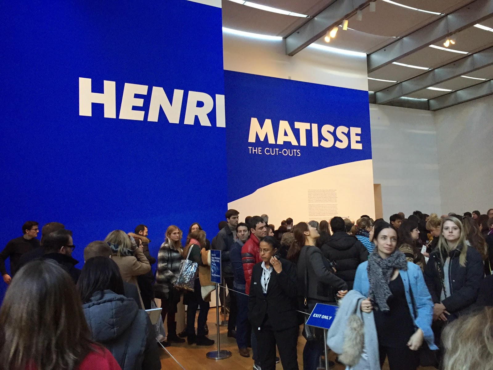
      This weekend I went to see The Cut-Outs exhibition by Henri Matisse. I heard so many snickered remarks by self proclaimed 'artistic' intelligent people ("oh my nephew can cut better than that" is one example).


      I was again upset in a museum.

      I have to admit, at first, I wasn't blown away by the exhibition. There were a million people milling around, it felt like people had their NYC 'to-do' list to fill, and after 30 years of going in and out of modern art exhibitions the novelty wears off. BUT like in a good yoga sun salutation, I paused, noticed and picked one thing to focus on. It was the voids between the cut-outs. I was suddenly blown away, the tension between lines and crocked pieces of paper seemed never ending, presenting so many new perspectives. Next time you look at your living room furniture and knick-knacks, try and see how much void you can put between them and if it changes your perspective.


      Tuesday, January 27, 2015

      No 2 Snow Facts are alike

      As we here in New England are buried deep under heap loads of snow, I thought some snow facts and thoughts are in order.


       No two snow flakes are alike, this to me is a mind boggling fact, the amount of creativity that simply falls down out of the sky amazes me.

      Snow loads are measured in PSI (pressure per square inch), if you are from New-England and have not been living under a rock, you know you won't be calling the Patriots any time soon, to build your new roof.

      In fact great consideration is taken when building a roof, not only the load is measured, but also the pitch and grade of the roof are measured. That is why in cold climates you'll see pitched roofs verses the flat roofs in warm climates.

      Snow is a wonderful heat insulator, it will always stay at 32F (0C), so if the wind chill goes bellow 0 the snow will actually keep your home warmer, that is if it's built with the right detail in mind. (otherwise you get in to Ice-Dam issues). In fact many gardeners like having snow over the ground, because it keeps the ground from actually freezing, and this protects the seeds.

      Snow also acts as a great sound insulator, the streets are quite not only because of travel bans, but also because of the air that each snow flake creates a great sound barrier, similar to foam.


      Snow is simply beautiful, my mind is forever challenged by the masses of white that cover yard furniture, stairs, and everyday things we just take for granted. The snow transforms them in such a way that inspire me as a designer to re-think the world around me.


      Stay warm!