Showing posts with label commercial design. Show all posts

Tuesday, October 4, 2016

Movement Makes Meaning

How we move in space has always been something that intrigued me.

When I was five years old, at my first ballet class, there was a young ballet teacher that made us pretended there was a string attached to top of our heads, and that is how we would be pulled up to sit up straight. I fell in love with the idea that something external and conceptual could make our body move in space. 

Dance is a big part of my life, being totally tone deaf, dance is my only musical outlet of expressing joy in non verbal means. When I imagine people enjoying a space I see them in my mind almost dancing in it. Floating from spot to spot, to a rhythm and tempo the space will provide them with. 

Watching dance performances always made for an exciting and inspiring moment for me, another means of interpreting use of space through choreography and the dancers abilities. Similar to space design there is a non verbal narrative that is left to the interpretation of the viewer or user. 

But this seemingly "free form" expression is only achieved, and will only be read well by viewers or space end users after rigorous training and practice. In order to be able to improvise in space or dance you need to know the basics, the ABC of the point/flex motions and the correct arm extension. 

Over the weekend this clarity came to my mind as I was watching a lyrical hip hop interpretation performance by Rapheal Xavier , he managed to take me on a movement journey, the likes of which I have not been on far too long. He thoughtfully taught me the DNA of movements and sounds that are part of hip hop and then ventured on to go back in time to the roots of hip hop, finishing his piece with the future of hip hop. 

It was short, beautiful, soulful and so thoughtful. It was a master class of how to clearly communicate movement in space -- I was truly moved. 

Monday, September 26, 2016

Losing Touch

Making coffee to a group of designers/architects always proved to be challenging. Never mind the personal taste they each had of how to drink their coffee, but you couldn't even pour it into the mugs lined up, everyone switched them up. 
It was almost ritual like -- one would come to the mugs lined up on the countertop, pick the mug up turn it 15 degrees left, then right, then look at the bottom of the mug, only then would one hold it with both hands, and if it felt like the right fit for that day -- you were able to pour the coffee into the mug. I can not make this stuff up. 

In the last few years more and more tactile biofeedback giving elements of our lives are disappearing. From the click-click-click of the typing machine to a touch screen, from turning a key to operate a car to pushing a button. It's almost like we are losing the ability to feel what we are supposed to do, that we are unlearning our brain to be able to decipher nuance of touch, a very primal part of our being. Some will claim this is part of evolution that it's not as bad as I think it is. But to me any ability we use to read our environment that is lost, is a shame. Any person who suffers from arthritis will attest that loss of sensation is almost like a phantom pain. 

Our society is suffering from this ability to feel contact. Though there are many trends of ergonomic seating, stand up desks, and special handles, they are already being built with the mindset of losing touch, not retaining it. 
In her book Sensation - the new science of physical intelligence, author Thelma Lobel describes how these moments of physical contact with everyday things, like drinking warm coffee before entering an important job interview, or switching on a light switch can trigger different sensations and spark new ideas and feelings. 

I'm not against moving forward while we make easy tabs available for toy manufacturers, but just being mindful that we also need to be conscious of the "touch free" environments we sometimes crave and create and what it must be doing to our soul. 

Monday, September 19, 2016

Time for Some Retail Therapy


"If you could be any store in the world, what store would you be?"

It's the first questions I ask first time clients when I meet them. Sounds like a silly almost juvenile type of question, right? But the response to this question loads me with so much information about a person's personal design sensibilities. Just the word IKEA evokes immediate visual and sensory reaction from any person -- the light birch color, clean lines, smell of cinnamon baked goods, bright light. 

But in the past few years or so things have shifted, it takes a person longer to respond to that question without being cynical and saying "Amazon". But that too is very telling. Our time has become a valuable commodity and between the hussle of very full and active family lives, and increasingly harder to balance work schedule -- going out shopping is not much fun anymore, where is in the past it was considered therapy. To me it feels like going into a teenagers room wanting to pick up after them.

Yes the economy was hit hard and we are in the odd in-between years of trying to marry good UX online with somewhat of a decent similar experience in brick and mortar storefronts - hey even Amazon is opening one! There is value for people to go out and shop, bump into friends, walk around and engage in different environments, while they consume more useless products. We humans need to have a purpose and meaning even if it's a simple one of getting a bar of soap. Most of us don't have a nice park or open space around us, the streets and shopping plazas become these communal arenas. 

Yet we are greeted with visual cacophony, most of it following "design rules" that pre-date the immediate click-of-the-button-swipe-of the-fingerprint era -- Loud music, harsh smells, disorienting product placements, bright lights, low or no-inventory that can easily be found online, a tired salesperson, long lines to pay or return items. Most of these stores are run down, people who work there are annoyed and tired because of entitled "let's just scan this items" consumers. The whole shopping experience has been reduced to that moment of email confirmation of "your item is on it's way". 

It's no secret these retailers are struggling, closing down stores leaving gaping holes in shopping malls, street plazas, and city centers. Which in turn leave us with almost ghost like places. Retailers have yet to make the adjustment to this new world of shopping experience, it's almost like they are at a loss and have given up completely. Like all of us in these odd and fickle economic times they too need to rethink cost-per-sqft or ROI -- yet we humans are not only the sum of that. And our reaction to the lack of seeing us as human in need of contact, efficient, pleasant places to be and interact in is that of that going online. 

Smaller more humanly accessible stores, where one can see the end of it, where there is some inkling experience that makes us pause, smile and give us a meaningful break in our day will go a long way in improving retailer's bottom line and user experience. I want to go back in time to the feeling of excitement I had at the end of the 90's start of 2000's when I pounded the streets of downtown trying to find the next big WOW moment that was supplied by exciting store designs that even the biggest names in architecture at the time were not ashamed to be part of. 
We all lose when a layer of our needs is taken away, and another human factor is lost into the efficient sterile cyber zone. 

Monday, November 30, 2015

FFF

FFF. Form Follows Function. Every contemporary designer aspires to reach THAT moment of the (in)famous concept of clarity in design. The term is a simple way to describe a level of purity in design. A moment where all the ornaments are pealed back, and you are left with the bear minimum needed to sustain the function of the chair/building/kitchen. 

Alexa's beaming 'circle of death'
This weekend as we were putting our christmas tree up, we were joined by a new member to our technical family - Alexa; a wireless voice activated speaker. The joy in our household quickly fizzled as it was clear Alexa was all Function and no Fun, the ultimate electronic FFF. Unlike Apple's Siri, Alexa would not respond to silly questions my 6y boy had come up with, leaving him hanging with her blue round 'circle of death' (as my 10y calls it) beaming in front of his eyes. I'm no Siri fan, to be honest all these voice activated devices make me feel uneasy, but at lease she has some artificial intelligence sense of humor built into her. 

Looking deeper into pure functional form of things is a true design exercise. I'll be the first to admit that I too, am a purist, coffee will be coffee no hazelnut-vanilla flavor for me, and I admire clean modern lines in clothing, furniture, light fixtures, and spaces. Usually things that are made to function well, will be less wasteful and harmful to our environment. BUT then I find something is lacking. A human touch, a smile, a sprinkle of sparkle. 

As we brought in our christmas tree, our usually clean lined home, suddenly became friendlier. It smelt like pine, and by the time we were done decorating our spirits were happy and joyful. If ever there was an antithesis to FFF - it's christmas. It's not sustainable, no clean lines, no function what so ever, and full of ornaments. What a christmas tree lacks in function it makes up for in full blown spirit, a magical feeling that we can put last year and it's troubles to bed, that rejuvenation is on its way. Not functional, yet truly valuable for us as humans to feel. 

We should not want to live an a highly functional society that in many ways acts like Alexa. Just looking into the personalities that have brought the likes of Siri and Alexa to the world will allow us a window into the algorithms that rule our day to day searches, and more important - finds. They narrow our peripheral view of things in life, they eliminate exploring further in new ways. This is alarming because as much as I like clean lines, and functional spaces, I love having happy sloppy and messy mistakes that allow me to pause and smile, remind me that after all I am human that not only Functions but also Feels. 

Monday, November 23, 2015

Happy Medium

There is no bigger evil in the world of the over achieving, insta-go-getting, facebook high rollers, than the word m-e-d-i-u-m. It's this stuck in the middle, static, neither here nor there option in life. It's not the cream of the crop, or the lowest of the low. A mentality of 'I'd rather miserably fail than be defined as mediocre'. No wonder there is the known phenomena of the "mid-life crisis". There is no sex appeal in middle. 


The pink logo creates a surprise in a 
well balanced space 
Or is there? 

It seems that humans have developed this odd, almost counter intuitive knack, to push boundaries, which is completely against any natural instinct. Nature always wishes to balance, to reach equilibrium. We as humans want for some unknown reason to defy that force of nature. We sleep less than we need to, we eat more than we should, we work longer hours, and in general don't really take very good care of ourselves and our environments. 

As a designer I like to keep things off balance, surprise the user of the space. I'll use bold colors where you won't necessary expect them. I'll align certain things that will keep you on your toes. But it's a delicate process that can't be done on a whim. These mis-alignments can only be done right when you have a balanced and clear idea, and when there is a solid anchor you can play off of. Otherwise it creates clutter, uneasiness and in general a feeling things were not thought out properly. So there is, you see, a certain method to the design madness. 

That is why a Happy Medium is one of the most critical things in our daily lives, and is one
of the hardest things to come by. (Ask any GC trying to level floors inside old homes). We need the temperature of the HVAC to be almost exactly the same in our work environments. Lighting and its brightness need to be precise. The height of our kitchen countertops is meticulously measured. 
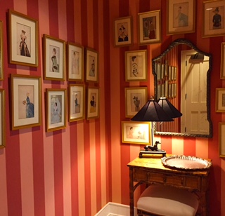
The seemingly cluttered and uneven photo alignment is 
made possible due the well balanced and centered table
& mirror. 
The length and height of stair risers. All of which are meticulous averages, which years of usage in the world have managed to come by. These "lowly" mediums are the anchors of our day to day life, the blocks from which we are allowed to soar to different places. In my view "Average" should be proclaimed as a new goal, a place we all should aspire to reach, a balance that redefines our center lines, and alignments. A Happy Medium. 


Monday, November 9, 2015

Design on the Run

The other night as I meticulously laid out my pre-race paraphernalia on the dinning room table, a familiar sensation hit me. It felt like the night before a final review or a big client presentation. 

A festive almost religious like rhythm and movement comes to mind. Picking out the right running clothes, the socks, the race number, the power gels, the good luck charms, uploading the right playlist. 
Until running my fourth big run, I never realized how much the design process and long distance running have in common. 


Pre-race layout
I always worked while listening to music, a beat to which I would carefully glue the model pieces in their right place, or hand draw the envisioned elevations. When I look at past work, I will always know which tune I was listening to at that time. Every race I go to I have a playlist ready for the rhythm needed for that part of the run, the warm up music will be different than the one for running up that very long hill. Design projects will have the same process of warming up (brainstorming, sketching, etc.), the long and tedious main course of the run (building, permits, fixing mistakes), and finally the dash to the finish line. 

Long distance running requires training and careful planning. Good design does too. I miss having that process followed to a T. The haphazard approach people have to the design process creates for a lot of contention and costly mistakes. It's almost akin to a 5K runner suddenly asked to run the Boston Marathon over night. The damage that can happen to the runner is clear. The same is true for the design process, there is a careful methodology to it, and when short cuts are made in that process, spaces seem incomplete or just don't look or feel right. 

The most successful, and rewarding projects I have been a part of, are the ones when I'm allowed in on the 'warm up' phase. From the point of helping decide which space will work better for a new office, and its growing team; to running up the hills of painful budget decision making, and exciting new spatial moments, which in my heart I know will make for the best working environment for that team. 

Office kitchen lounge in the making 
And like with running, going all the way up to the finish line, when every fiber of my being is dead-on focused on getting it done right and on time, (the counter top edges should be mitered, the layout of the flooring, and the thermostat should not be in the middle of the feature wall...) one foot after the other. 

Monday, October 26, 2015

One for the team!

Last week I happened to listen to a piece on the radio about the decline of team sports in America. As a mother of 3 kids, 2 of which are part of team sports, it got my attention. Aside from all the back and forth about costs, lack of interest of the kids, helicopter parenting, etc. It got me thinking that in fact there might be a greater issue at hand, something that I worry about. I fear that there is a 'flattening' of our society to what the Blue Man Group calls the 2 and 1/2 dimension.
 
As a society at this point I find we lack rigor and will to make that extra effort. Most of us will admit we do not wish to spend the effort or time driving kids to god forsaken places to get ice-time or pool time, it requires effort, planning ahead, and yes dealing with an uncomfortable option your kid may lose. We want things to be happy, crisp, clean and so very easy, which is kind of like flat coke. 

This lack of rigor, commitment and effort hold true in many fields nowadays, the one in particular I'm concerned about is the area of design. Things look very easy on HGTV and it's off shoots, places like communal painter spots which allow us all to be Picasso for a night, easy measuring apps, 9 minute pasta dishes, easy 1 click furniture shopping, you name it. We are all short for time and by way of that we forget to stop and dig deeper into things, investigate them a little, expand our knowledge, and do some of the 'dirty' redundant work that is required. 

About 6 years ago, the Tate Modern in London held a special exhibition to celebrate the 10th year anniversary of its building. I have an affinity to this building, and greatly admire the Swiss architects, Herzog De Meuron who designed it. So my disappointment when I saw the turbine hall exhibitors, was huge. Here there was a once in a life time opportunity to articulate a thoughtful artistic display, and what it ended up being was a sad display of our declining culture. The exhibitors themselves were busy on their phones/computers "connecting" via social media. They forgot to connect their display to the building or the viewers who came to experience it, it felt haphazard, and not very well put together. 

But why do these things rub me the wrong way so much? Is there a connection between the lack of rigor and discipline to poor design choices? Maybe yes, maybe no. What I do know though is that good design requires attention to details not only to plans, flashy 3D models, but also to people and their behavior, culture and language. Good design can be full of humor and thoughtful when there is an investment in liberal arts and history education, not just when it comes from a DIY kit. 

Design is a language and as one who is bilingual, and studied a third - I can earnestly say that is requires rigor, and hard work, skills that in essence can be learned while doing team sports. 

Tuesday, July 28, 2015

Blank Space

This weekend I was at a Taylor Swift concert in a massive football stadium. And at the risk pitting the world of 'Swifters' against me, I'm going to be forward and say it was just OK, if not border line boring and uninspiring. So much so that even my 9y, who has waited since February (her birthday gift), asked to leave the place about an 45min after Ms. Swift made her way on stage.

That to me was very telling and made me think why was it just an OK concert. Why wasn't I moved by this talented, and in my view, extremely intelligent woman. Everything was OK the lighting, the weather, the audience... Everything was pleasant and comfortable so numbingly comfortable. It was right out plain and boring like a slice of white bread. And that worries me, the kind of worry I lose sleep over.

Years ago I worked at a lighting design firm in Tel-Aviv. It was an extremely unique opportunity to hone and deepen my design skills. I worked with many light fixture manufacturers from around the world. On very rare occasions I would specify American fixtures, it had nothing to do with voltage differences, it had to do with the fixtures themselves. They were OK, they were functional, and of high quality, but they were not interesting, they did not move me emotionally or tell a story through their design. Like Taylor Swift, they too were making me feel numb.


This is why I worry, I worry because people like TS have a huge impact (Swift vs. Apple corporation, anyone?), the trickle down effect of her incredible abilities were reduced so much in the concert I attended, it felt I went to see a totally different singer than I expected. But TS's concert to me is only one symptom of how our culture is been driven into this Hunger Games numbing spiral of sorts. From quick fix reality TV shows, easy on the eye FB profile photos, to very pleasant concerts, who leave no actual mark inside our souls.

And it's an issue, because the great cultural legacy we will leave behind, might turn out to be very
dull and uninspiring. Which in turn will make our society very beige and lackluster.

For the sake of my 9y and her two other siblings I want to deepen the cultural legacy, so that their wings can spread wider. I want them to learn how to push the envelope, set out from the comfort of the box and get a little uncomfortable, so they too will better understand how to create, how to solve problems on their own not according to templet, so they won't grow to be culturally and emotionally numb. So they won't end up in a blank space. 

Monday, July 6, 2015

A moment in Time


This past weekend marked the 239th year of America, it was my 38th birthday. Usually around ones birthday, passing of time becomes more tangible, almost felt as another dimension or being. 

Time is a tricky element, though quantifiable by objective measures like seconds, minutes, days, it can also become very subjective when you feel that time flies when you are having fun, or that last minute of running that seems move so very slow. 

If you ever walked into a a retail store you would notice that there are no clocks to be seen, so as not to rush you. This unlike train stations where they can be seen all around. Classrooms have clocks on the walls, maybe they should be taken away so kids don't feel like time in school drags on for-EVER. My personal favorite is the one on airplane screens making me appreciate every second of turbulence. 

In design the role of time becomes like another element, from the "look and feel" of contemporary pieces or antiques, to the sense of timing in the space. How long it takes you to get from point A to B in a space can be crucial when many users need to use it. Emergency rooms are a great example of how lack of thought about the timing of receiving the patient can be the difference between life or death. Carefully monitoring the time cars are stuck in a traffic jam can make all the difference of air quality during certain times of the day. 


But there are also places where the design calls on you to pause and enjoy, thus creating a moment in time. It could be art work placed at a certain position, a change in flooring that will make you slow down and create a different rhythm to your stride. The ones I like the most are of carefully placed seats, allowing for a full stop in time to enjoy what is around you. 

Monday, May 18, 2015

The Sound of Silence


The basic need of quite in one's life can't be underrated. Research shows that being around noise pollution sources can cause serious health issues. That is why cities have guidelines pertaining specifically to the issue of noise.

What is interesting to me as a designer is creating quite zones, and moments with-in a space. Best example I had encountered of coming in and out of silence is in a swimming meet. I often ask my daughter, do you hear us cheer? With a big smile over her face she says, "no it is so quite in the water it's the best thing". The silence of the water keeps her safe from the competition's stress.

Many commercial places make the mistake of cranking up the volume, to a point of complete disorientation, it seems these are the places, that are starting to see cuts in revenues. Noisy restaurants may seem appealing when you walk in, but the charm of the loud music or boomy chatter wares you down, and asking for the check seems like the right exit move. Even hectic cities take a toll on people. I know that I love to visit New-York city, but I've learned I also like to say goodbye.

The basic way sound works is by traveling through some sort of medium like solid, liquid or gas, by vibrating the molecules. The density of the medium (spacing of the molecules), will determine how fast the sound will travel through it. The denser the medium, the faster sound will travel through it. So hard table tops, combined with hard flooring surfaces and bare walls - make for a very boomy and loud environment.

There are ways to mitigate some of the noise disruptions. I've seen people wear noise reduction headphones on airplanes, and open office spaces. There are special rooms where one can leave the open space to take on a phone call in a more private setting. Carpets and their padding also help. Architecturally walls can be built with more sound proofing - mainly by adding air of sorts. Anything that will help keep the house warm or cold, will also help with sound proofing i.e. foam insulation, double paned windows. In some restaurants I have seen foam padding under the table and seats (not a pretty sight). Some public places even go to the extreme and use a 'high-pitch' device to keep younger people from loitering and making noise around the area.

But I have to admit these solutions are usually not visually pleasing. Yes we can put more and more rugs or carpets, but what if there are allergies, or we just like the look of hardwood floors? Just googling the words 'sound proofing' brings up pretty basic solutions, some are more pleasing to the eye, some less. I have even once found there is a whole world of sound proofing art work (basically felt cut into landscapes).

Any of these things can help, but I also think that as our living areas get more condense, there should be a behavioral change in our environments. I don't need to walk into a store where the music is cranked up, or a bar where the hockey game is put on so loud I can no longer sit in there. I want to enjoy looking a things in a store without having the urge to bolt, I want to enjoy my dinner with a side of the hockey game not IT being the event. I really want as Simon and Garfunkel so aptly sing is to enjoy The Sound of Silence.


Monday, May 11, 2015

Visual Cleanse

"Less is more" one of the most iconic phrases coined by one of modern architecture's forefathers, Ludwig Mies van der Rohe. I have to admit that until recently I sort of got this phrase. I even use it quite a bit. Yes it means less ornate type of things, a striped down version of a window trim, purity of line, light and space. In short it means very stark places where one feels they can't really move anything around, less they want to upset the meticulous balance achieved.

I was fortunate to study, and live in one the worlds' most thriving Bauhaus cities in the world, Tel-Aviv. For years I got to examine and absorb the pure lines, cantilevered balconies, bare no frills entryways. To be honest at first I thought it the most ugly city in the world. It felt bleak, uninviting, and unlike cities in Europe there wasn't until about 15 years ago, any urban policy of preservation set in place. Though many will argue not enough is being done to salvage these buildings, enough are considered historic and have undergone extensive renovations. The city has been beautified with these gems.

Then I moved to America and was struck by the amount of trim, the endless array of baseboard finishes, not to mention the ever terrifying crown molding, and don't even get me started on chair rails. I was intimidated by all these things added on to spaces, only to learn these are perfect for hiding construction imperfections. You see, you can't hide behind clean lines - they have to be perfect plum, and aligned, they require a different set of skills.

Which brings me to the small revelation I had last week. Nowadays I don't really walk into stores, aside from the online options, I get tired and disoriented by the sound, light, clutter, abundance of options. But last week I had too, the screen of my phone cracked, and had to be replaced. I walked into a slick, clean, striped down space, adorned with some monochromatic images - very modern stark looking place. A space where I knew exactly who to talk to, easily navigate through the space, no bells and whistles. A place that as I was walking into, I was immediately seen and greeted. It was a space where when the person that helped me smiled at me, I actually saw the smile, and could hear what was been said to me clearly. The space lent it self to human interaction like no other commercial space I have been to lately. And if I'm honest, it caught me by surprise. That moment made me deeply understand the meaning of less is more, and how human centric that saying is. How ingenious it is to clear the visual clutter (just the view of a news room on TV sets me into hyperactive aggressive mode), and allow for the person in that space to be able to see, hear and in return be seen and heard. I have a feeling that there is a reason why of this kind of store can succeed for many years, because it's not only the buyer feeling clarity in the space, but also the people who work there. We need to think together how we can cleanse the visual clutter around us, I think it will allow us to see each other better.