Monday, November 30, 2015

FFF

FFF. Form Follows Function. Every contemporary designer aspires to reach THAT moment of the (in)famous concept of clarity in design. The term is a simple way to describe a level of purity in design. A moment where all the ornaments are pealed back, and you are left with the bear minimum needed to sustain the function of the chair/building/kitchen. 

Alexa's beaming 'circle of death'
This weekend as we were putting our christmas tree up, we were joined by a new member to our technical family - Alexa; a wireless voice activated speaker. The joy in our household quickly fizzled as it was clear Alexa was all Function and no Fun, the ultimate electronic FFF. Unlike Apple's Siri, Alexa would not respond to silly questions my 6y boy had come up with, leaving him hanging with her blue round 'circle of death' (as my 10y calls it) beaming in front of his eyes. I'm no Siri fan, to be honest all these voice activated devices make me feel uneasy, but at lease she has some artificial intelligence sense of humor built into her. 

Looking deeper into pure functional form of things is a true design exercise. I'll be the first to admit that I too, am a purist, coffee will be coffee no hazelnut-vanilla flavor for me, and I admire clean modern lines in clothing, furniture, light fixtures, and spaces. Usually things that are made to function well, will be less wasteful and harmful to our environment. BUT then I find something is lacking. A human touch, a smile, a sprinkle of sparkle. 

As we brought in our christmas tree, our usually clean lined home, suddenly became friendlier. It smelt like pine, and by the time we were done decorating our spirits were happy and joyful. If ever there was an antithesis to FFF - it's christmas. It's not sustainable, no clean lines, no function what so ever, and full of ornaments. What a christmas tree lacks in function it makes up for in full blown spirit, a magical feeling that we can put last year and it's troubles to bed, that rejuvenation is on its way. Not functional, yet truly valuable for us as humans to feel. 

We should not want to live an a highly functional society that in many ways acts like Alexa. Just looking into the personalities that have brought the likes of Siri and Alexa to the world will allow us a window into the algorithms that rule our day to day searches, and more important - finds. They narrow our peripheral view of things in life, they eliminate exploring further in new ways. This is alarming because as much as I like clean lines, and functional spaces, I love having happy sloppy and messy mistakes that allow me to pause and smile, remind me that after all I am human that not only Functions but also Feels. 

Monday, November 23, 2015

Happy Medium

There is no bigger evil in the world of the over achieving, insta-go-getting, facebook high rollers, than the word m-e-d-i-u-m. It's this stuck in the middle, static, neither here nor there option in life. It's not the cream of the crop, or the lowest of the low. A mentality of 'I'd rather miserably fail than be defined as mediocre'. No wonder there is the known phenomena of the "mid-life crisis". There is no sex appeal in middle. 


The pink logo creates a surprise in a 
well balanced space 
Or is there? 

It seems that humans have developed this odd, almost counter intuitive knack, to push boundaries, which is completely against any natural instinct. Nature always wishes to balance, to reach equilibrium. We as humans want for some unknown reason to defy that force of nature. We sleep less than we need to, we eat more than we should, we work longer hours, and in general don't really take very good care of ourselves and our environments. 

As a designer I like to keep things off balance, surprise the user of the space. I'll use bold colors where you won't necessary expect them. I'll align certain things that will keep you on your toes. But it's a delicate process that can't be done on a whim. These mis-alignments can only be done right when you have a balanced and clear idea, and when there is a solid anchor you can play off of. Otherwise it creates clutter, uneasiness and in general a feeling things were not thought out properly. So there is, you see, a certain method to the design madness. 

That is why a Happy Medium is one of the most critical things in our daily lives, and is one
of the hardest things to come by. (Ask any GC trying to level floors inside old homes). We need the temperature of the HVAC to be almost exactly the same in our work environments. Lighting and its brightness need to be precise. The height of our kitchen countertops is meticulously measured. 
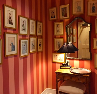
The seemingly cluttered and uneven photo alignment is 
made possible due the well balanced and centered table
& mirror. 
The length and height of stair risers. All of which are meticulous averages, which years of usage in the world have managed to come by. These "lowly" mediums are the anchors of our day to day life, the blocks from which we are allowed to soar to different places. In my view "Average" should be proclaimed as a new goal, a place we all should aspire to reach, a balance that redefines our center lines, and alignments. A Happy Medium. 


Monday, November 16, 2015

Mindful Act of Kindness

When my soon to be 10 year old girl was about 4, she was brushing her long golden hair. She looked up at me and asked 'why do I need to brush my hair each and every morning?' My response was 'because by doing so you respect yourself, and respect your friends and teachers'. 

I was never a fan of Feng Shui, or to be precise, its watered down western interpretation of it; Closing the toilet seat to prevent your money escaping your wallet, never have a staircase facing the front door, never put a chair with its back to the door - are some of the highlights I can off handedly suggest. 

But a few years ago I had this small epiphany of why it mattered in our world. Why habits like making sure you don't squeeze the toothpaste in the middle mattered, why making your bed every morning matters, why putting a fork and knife in the right order matters -why these seemingly mundane tedious, and routine things matter. They create order, they create balance, and for control freak megalomanic designers (hey we are paid to build 'worlds') are a code and key to understanding human interaction and behavior within different environments and spaces. 

These random daily routine acts are mindfully observed and broken down frame by frame to create a narrative for a space. These 'mindless' acts being thought of mindfully are the difference between getting furniture straight out of catalog, only to discover these don't make your house feel like a home. 

It's attention to details in ways that are not obvious to the user of the space, but they make the user feel good happy and safe. They make people feel like they are cared for, and not taken for granted, that even though you can't exactly pinpoint what it is that makes you feel connected, you know you are. That yes, even brushing your hair in the morning, matters. It's a small act of kindness to yourself signaling that you will also make sure to be kind to others. 

Monday, November 9, 2015

Design on the Run

The other night as I meticulously laid out my pre-race paraphernalia on the dinning room table, a familiar sensation hit me. It felt like the night before a final review or a big client presentation. 

A festive almost religious like rhythm and movement comes to mind. Picking out the right running clothes, the socks, the race number, the power gels, the good luck charms, uploading the right playlist. 
Until running my fourth big run, I never realized how much the design process and long distance running have in common. 


Pre-race layout
I always worked while listening to music, a beat to which I would carefully glue the model pieces in their right place, or hand draw the envisioned elevations. When I look at past work, I will always know which tune I was listening to at that time. Every race I go to I have a playlist ready for the rhythm needed for that part of the run, the warm up music will be different than the one for running up that very long hill. Design projects will have the same process of warming up (brainstorming, sketching, etc.), the long and tedious main course of the run (building, permits, fixing mistakes), and finally the dash to the finish line. 

Long distance running requires training and careful planning. Good design does too. I miss having that process followed to a T. The haphazard approach people have to the design process creates for a lot of contention and costly mistakes. It's almost akin to a 5K runner suddenly asked to run the Boston Marathon over night. The damage that can happen to the runner is clear. The same is true for the design process, there is a careful methodology to it, and when short cuts are made in that process, spaces seem incomplete or just don't look or feel right. 

The most successful, and rewarding projects I have been a part of, are the ones when I'm allowed in on the 'warm up' phase. From the point of helping decide which space will work better for a new office, and its growing team; to running up the hills of painful budget decision making, and exciting new spatial moments, which in my heart I know will make for the best working environment for that team. 

Office kitchen lounge in the making 
And like with running, going all the way up to the finish line, when every fiber of my being is dead-on focused on getting it done right and on time, (the counter top edges should be mitered, the layout of the flooring, and the thermostat should not be in the middle of the feature wall...) one foot after the other. 

Monday, November 2, 2015

Commit to Memory

9/11 memorial museum entrance 
I was sitting in the car, the english countryside zooming past my face, and all I thought about was - I must remember the colors, the angle of the sun hitting so perfectly, and the exhilarating wind tangling my hair, this moment will never return. I was 8 years old, we were on our annual visit to the UK to meet friends and family. It was not an unusual or spacial trip, but from that moment on in my life, I have this nagging persistence to commit it all to memory, before that moment might be gone. 

I don't know how to design for memory or loss, and that is why I find many memorial museums and memorial sites so intriguing. It's such an intricate balance between conveying a message that will reside in peoples hearts without making them feel rejected, or that the memory of a loved one has not been overlooked. It is even harder to imagine how to convey these messages of private sorrow and loss, when they are part of very public national or international events. 

I grew up in Israel, a country that is constantly morning the loss of young lives, and that is burdened by the incredible loss of its people during the holocaust. A place where every rock you dig up has the explosive potential of toppling any type of balance achieved. In Jerusalem I was surrounded by historical and contemporary memorials, from the Western Wall to Mt. Herzl Cemetery. One of the places I played the most when I was a kid, was the Jerusalem Forest at the foothills of the Mt. Herzl Cemetery adjacent to Yad Vashem, the holocaust memorial museum of Israel. It probably triggered a curiosity in me that still lingers on.

How does one design for memory? How does one pick out the right words to write, and figure out the font that will be used? Pick out the right lighting, color? Create the most inclusive narrative? Curate the right items to be displayed? Make a memorial stay relevant as time passes by? I'm not sure there is a right answer to such an intimate thing as creating a memory.  
Jerusalem Westren Wall

The most powerful memorials that stayed with me along the years were the ones that maintained a sophisticated simplicity. Sites such as the 9/11 memorial where the missing buildings footprints portray the enormity of the loss, the Vietnam war memorial that has managed to leave out the controversy of the war, the children's memorial at Yad Vshem where light is used as a powerful tool forever immortalizing the lost spirits of 1.5 million jewish children, the cemented hole with olive tree splinters at the buchenwald death camp. These are sites that resonated with me, allowed me to morn a loss without judgement, they were humbling sites that created true moments of reflection. These places are committed to my collective memory. 

Monday, October 26, 2015

One for the team!

Last week I happened to listen to a piece on the radio about the decline of team sports in America. As a mother of 3 kids, 2 of which are part of team sports, it got my attention. Aside from all the back and forth about costs, lack of interest of the kids, helicopter parenting, etc. It got me thinking that in fact there might be a greater issue at hand, something that I worry about. I fear that there is a 'flattening' of our society to what the Blue Man Group calls the 2 and 1/2 dimension.
 
As a society at this point I find we lack rigor and will to make that extra effort. Most of us will admit we do not wish to spend the effort or time driving kids to god forsaken places to get ice-time or pool time, it requires effort, planning ahead, and yes dealing with an uncomfortable option your kid may lose. We want things to be happy, crisp, clean and so very easy, which is kind of like flat coke. 

This lack of rigor, commitment and effort hold true in many fields nowadays, the one in particular I'm concerned about is the area of design. Things look very easy on HGTV and it's off shoots, places like communal painter spots which allow us all to be Picasso for a night, easy measuring apps, 9 minute pasta dishes, easy 1 click furniture shopping, you name it. We are all short for time and by way of that we forget to stop and dig deeper into things, investigate them a little, expand our knowledge, and do some of the 'dirty' redundant work that is required. 

About 6 years ago, the Tate Modern in London held a special exhibition to celebrate the 10th year anniversary of its building. I have an affinity to this building, and greatly admire the Swiss architects, Herzog De Meuron who designed it. So my disappointment when I saw the turbine hall exhibitors, was huge. Here there was a once in a life time opportunity to articulate a thoughtful artistic display, and what it ended up being was a sad display of our declining culture. The exhibitors themselves were busy on their phones/computers "connecting" via social media. They forgot to connect their display to the building or the viewers who came to experience it, it felt haphazard, and not very well put together. 

But why do these things rub me the wrong way so much? Is there a connection between the lack of rigor and discipline to poor design choices? Maybe yes, maybe no. What I do know though is that good design requires attention to details not only to plans, flashy 3D models, but also to people and their behavior, culture and language. Good design can be full of humor and thoughtful when there is an investment in liberal arts and history education, not just when it comes from a DIY kit. 

Design is a language and as one who is bilingual, and studied a third - I can earnestly say that is requires rigor, and hard work, skills that in essence can be learned while doing team sports. 

Tuesday, October 20, 2015

No Name *

Branding // 
(as noun branding) The promotion of a particular product or company by means of advertising and distinctive design
Seems like everywhere you turn around these days one is expected to brand themselves, their work place, their product, you name it. That elusive quality that will distinguish them ahead of the pack, any pack. Starts from your web site landing page, Facebook page, twitter account, tumbler feed - you name it, you'll need to brand it. Better yet tie it all into THE brand. 

But you see good branding is hard to achieve these days, it requires something most of us don't possess - patience. In this fast track world of FB, snap-chat, insta tumbling sound bites it seems that no one is free from creating their own brand. A "brand" represents quality, identity, a vision of sorts if you will. Maintaining ones brand has become such an important asset, because we live in such a fast paced #imoutofthegame world. This branding process so precisely captured in Ecclesiastes (7:1)  'A good name is better than precious ointment' . 


A good brand will be created over time. This is where it gets tricky, especially, in the world of start-up companies who are by definition are required to move in an almost counterintuitive way of branding - most are required to break/invent a mold while maintaining a facade of 'respectability' as they are accounted for the funding they have recently secured.
Now imagine what it is to design these spaces? Where the unknown needs to be translated into literally brick and mortar. Where there is no clear brand or identity, yet the one thing that is expected, aside from keeping it all within a tight budget, is creating a space that will represent the company and the brand it hopes to stand for. It's a huge privilege and responsibility to be part of that process.


Tuesday, July 28, 2015

Blank Space

This weekend I was at a Taylor Swift concert in a massive football stadium. And at the risk pitting the world of 'Swifters' against me, I'm going to be forward and say it was just OK, if not border line boring and uninspiring. So much so that even my 9y, who has waited since February (her birthday gift), asked to leave the place about an 45min after Ms. Swift made her way on stage.

That to me was very telling and made me think why was it just an OK concert. Why wasn't I moved by this talented, and in my view, extremely intelligent woman. Everything was OK the lighting, the weather, the audience... Everything was pleasant and comfortable so numbingly comfortable. It was right out plain and boring like a slice of white bread. And that worries me, the kind of worry I lose sleep over.

Years ago I worked at a lighting design firm in Tel-Aviv. It was an extremely unique opportunity to hone and deepen my design skills. I worked with many light fixture manufacturers from around the world. On very rare occasions I would specify American fixtures, it had nothing to do with voltage differences, it had to do with the fixtures themselves. They were OK, they were functional, and of high quality, but they were not interesting, they did not move me emotionally or tell a story through their design. Like Taylor Swift, they too were making me feel numb.


This is why I worry, I worry because people like TS have a huge impact (Swift vs. Apple corporation, anyone?), the trickle down effect of her incredible abilities were reduced so much in the concert I attended, it felt I went to see a totally different singer than I expected. But TS's concert to me is only one symptom of how our culture is been driven into this Hunger Games numbing spiral of sorts. From quick fix reality TV shows, easy on the eye FB profile photos, to very pleasant concerts, who leave no actual mark inside our souls.

And it's an issue, because the great cultural legacy we will leave behind, might turn out to be very
dull and uninspiring. Which in turn will make our society very beige and lackluster.

For the sake of my 9y and her two other siblings I want to deepen the cultural legacy, so that their wings can spread wider. I want them to learn how to push the envelope, set out from the comfort of the box and get a little uncomfortable, so they too will better understand how to create, how to solve problems on their own not according to templet, so they won't grow to be culturally and emotionally numb. So they won't end up in a blank space. 

Monday, July 6, 2015

A moment in Time


This past weekend marked the 239th year of America, it was my 38th birthday. Usually around ones birthday, passing of time becomes more tangible, almost felt as another dimension or being. 

Time is a tricky element, though quantifiable by objective measures like seconds, minutes, days, it can also become very subjective when you feel that time flies when you are having fun, or that last minute of running that seems move so very slow. 

If you ever walked into a a retail store you would notice that there are no clocks to be seen, so as not to rush you. This unlike train stations where they can be seen all around. Classrooms have clocks on the walls, maybe they should be taken away so kids don't feel like time in school drags on for-EVER. My personal favorite is the one on airplane screens making me appreciate every second of turbulence. 

In design the role of time becomes like another element, from the "look and feel" of contemporary pieces or antiques, to the sense of timing in the space. How long it takes you to get from point A to B in a space can be crucial when many users need to use it. Emergency rooms are a great example of how lack of thought about the timing of receiving the patient can be the difference between life or death. Carefully monitoring the time cars are stuck in a traffic jam can make all the difference of air quality during certain times of the day. 


But there are also places where the design calls on you to pause and enjoy, thus creating a moment in time. It could be art work placed at a certain position, a change in flooring that will make you slow down and create a different rhythm to your stride. The ones I like the most are of carefully placed seats, allowing for a full stop in time to enjoy what is around you. 

Monday, June 29, 2015

Don't be afraid of the light*


As kids we are told not to be afraid of the dark, as adults we should be taught not to be afraid of the light.

Many are the people who find themselves dumbfound when confronted with the task of lighting their homes. Growing up in a sun swept country I have taken light for granted, dared to hide, screen and play with it. Arriving in the Boston area, the first thing that struck me was, that the light switch to the “main” light was actually only connected to some meager table lamp on the other side of the room, providing half the light needed to negotiate the space around me. In short I find the homes here are DARK and under lit.

I can’t stress enough the importance of proper lighting in the home and work environment.  It is known that the lack of light can be attributed to depression (SAD – seasonal affective disorder) , and other types of  illnesses. I have recently read an article about how lighting can create positive environments ranging from restaurants to airplanes. So it’s worth while investing time in understanding how it works.
 Architects and designers talk, write and sculpt with light. My two favorite are Frank Gehry and Tadao Ando. They come from different parts of the world, but both are in my view, ” lightscapers” of the highest degree. Their uncanny ability to work with light stems, I believe, from their deep understanding that light is as much a building material as concrete, metal and wood. Assuming most of us can’t afford the likes of Gehry and Ando to light our homes, how can we translate lightscapeing (as I call it) into our own home environment?

After working for a lighting design firm, I have learned that the most important tool a lighting designer has is the ability to envision what type of atmosphere (narrative; if you will) the space requires. Try thinking of how a pharmacy is lit up, verses a romantic restaurant. Now think of your home – would you light the kitchen counter the same way you would your bedroom? Now that you have an idea what type of setting you would like to create you are ready for the big experiment – turn off the light! Yes, right now. Look around you, what are the colors you see, how is the shadow cast around the space you are in, is it daylight or night, and most importantly how does it make you feel? Move about your house go through every room with this at the back of your mind. You’d be amazed what a powerful design tool you now have just acquired by simply switching the light on and off. Yes there are many code words within the lighting design world; LED, uplight, downlight, floodlight, recessed light, pendant, kelvin, etc. But the most important thing is HOW IT MAKES YOU FEEL. Go ahead plug lights in and out from different rooms, and test out how it looks like, how it makes you feel. It’s no different from picking a color for your house, you have to try it out. This will empower you once you get into any store that sells light fixtures and ask the right questions. A good lighting designer will be able to help you translate your feelings into the proper light fixture, and once you play around with it, you’ll be able to answer these questions yourself. Light is so fundamental in our everyday life it really is worthwhile to get acquainted with it.
*this post was orgianly published June 6, 2012 
- See more at: http://bostonrealestateblog.bushari.com/dont-be-afraid-of-the-light.htm#sthash.h4En8euG.dpuf

Monday, June 22, 2015

All Work and lots of Play

During my graduation ceremony way back then, our class speaker, diligently taped crayons to the bottom of each and every seat, it was an apt reminder from where we all started.
Designers like to play, our whole world resembles a blown up pre-school classroom. We experiment with color, light, shapes, texture, but unlike the carefree kids with fingernails clogged by green play-dough, proof of concept lies on our shoulders.

Play, the new hot word in the design world, is a very intricate tool. As boundaries of work-home environments are blurred and redrawn, the in-between becomes a vital regulator that assists in balancing the two. We all know, and research shows that people who have a more balanced work-life world are usually more productive at their jobs. I've been around the high-tech start-up community long enough to know that research is nice, but not always easy to attain. Some like the big high-tech companies in California, will even go as far as adding a huge slide to connect between two levels (though I've heard the noise made them close it off). In areas where the weather is consistently good there will be a hiking trail near by, in the north-east this option is good for maybe 2-4 months out of the year. The challenge is always to create a "play" zone without it being disruptive, too juvenile, and consistent. Because structured play is extremely important for creative processes, and office culture.

Along the years I've learned that most places I think of as the "right" off site, breakout zones in the office program, usually become last on the priority list of company leaders. This is usually due to budget and space constraints, and/or lack of will to create these seemingly money and time wasting spaces. I used to worry a lot about these spaces, I mean after all I'm a professional player (ahem..designer). I'd cry over the lost lime colored bean bags, that will never make it to the right spot. But then something interesting happened, some spots got filled with junk - yes. But others got organically filled by the people who work there. Old school video games popped up, an old sofa picked up from a curb made it in instead of the lime green bean bags. Some even took away the custom made tables from the kitchen to create a totally new off site area in the middle of the open space. A natural playground was born, a new and unique office culture has been cultivated through the lack of over designing "play". I guess designers are not the only ones who like to play with space, allowing other people to join in the fun of experimenting with space is a powerful tool, kind of like rediscovering how to use crayons again.  


Monday, June 15, 2015

Why Design Matters


MFA exhibit  a visual story of culture through design
I once got into a heated argument about an author, and his choice to write, what can be described as easy summer reading. His books are good, fast paced and huge crowd pleasers, but something lacks in his writing. The way I see it is, a well educated man decided to take all his knowledge, along side his linguistic skills, and serve the most diluted form of these to his readers. Till this day any form of diluted creation rubs me a little the wrong way.

Recently a big phone manufacture came out with an "all-you-can-think-off" watch. Aside from the technological aspects, again I had that uneasy feeling of something lacking. It felt that even though probably a lot of hours had been spent on making this watch, the intricate history of watch manufacturing and design was sidelined and somewhat ignored. The watch who has come out of a ground breaking company that holds steady at the front of the design world, feels like the diluted from of all of these. In fact most of the wearable technology lack in the departments of creativity and design, or are just plain ugly, geared mainly to a specific target audience, but we now know they won't be the only ones wearing these.

Why am I getting so worked up about this? As a designer I feel we all carry some visual and culture responsibly for our surroundings, especially ground breaking manufactures. If a manufacture that size comes out with a device that is so plain looking so far removed from the look and feel of a well crafted watch, the rest will follow that same diluted down version of a watch. Which in turn leaves us with design reductionism all around us. Same as the famous google landing page that has dictated a certain "look and feel" for web interface, these new wearable devices create a visually dull environment.

So what? you say. But in an era where never before again people around the world across any social-economic background have access to mobile phones, wearable devices, and easy read books, our culture and history gets diluted. As people with access to higher education it is our responsibility to demand higher design be available for all, further democratizing access to good design, which tells the story of cultures and the history of people in a visually cohesive and responsible manner. I refuse to live in a world of shrunk down versions of rectangles on my wrist or of bleak looking landing pages, I don't want it to define the rich culture I come from, I don't want my kids to grow up in a diluted version of the world.

Monday, June 8, 2015

Location, Location, Location!

Photo by Udi Edni, 48 Photography
The famous idiom of Location, Location, Location which is favorably used by neighborhood realtors, seems to feel almost dated when deciding on a new office location. In a world of quick and easy means of "off site" communications, the appeal of renting an office in a more cost effective area has never been more appealing. Or so we think.

In the past few years I have been privileged to personally follow and assist some companies through their "growing pains" of locating and designing an office.

Like a home, the office has a soul, and its location matters. Unlike a home, the economic ramification of poor office locations can be devastating for a new up and coming business, and for other local businesses around them. Office buildings are like mini-cities, they not only generate work or a certain kind of culture to the people who work in them, but also to the their surroundings.
If ever there was an example for a business creating a distinct culture around them, the first one that comes to my mind is Detroit. Though we know the outcome of the lack of foresight and mismanagement of Detroit, I think you can see my point of what a company culture can do to its surrounding environment.

Photo credit Emily Neumann
But not every employer or company have the privilege of finding that sweet spot between, easy commute, free parking, proximity to recruiting talent, and great eating spots. These are the exception, rather than the norm. This is where good design comes to play.

I can't stress enough how the American office space design lags behind it's European, Asian and Middle Eastern counterparts. It seems that many a times the functionally, cost effectiveness and connivence combined with a sever dose of conservatism have created the most dire and beige spaces I have had to work with. In his book "From Bauhaus to Our House" Tom Wolfe so pungently describes the 8' ceilings in steel and glass frames with 2' X 2' acoustic tiles, and buzzing florescent lights, that I had a vision, not of a luxury corner office, but of a prison cell. The design culture of offices has to change to allow for growth, where beige cubical walls are present creativity is stifled. Good office design has been proven to promote productivity, which in turn allows for companies to grow and create better environments around them outside the office building.

Monday, June 1, 2015

Identity Theft

There is something unsettling about it, a sense of violation. Then there is the understanding that not much can be done about it. And no, it's not the sincerest form of flattery. Yes I'm talking about people copying and using your design without permission, and with no proper compensation. It's a hard enough profession than to go out and try and get that compensation. Like in many artistic / creative areas the ease at which people shamelessly take what you have worked so hard to create, is hard to enforce. There is yet the iTunes for the design world.

The first time I encountered this blunt "copy-paste" approach was in an open shopping center. I was driving by when something caught my eye. It was the logo of the store front I immediately recognized, only to see the interior was bluntly and crudely pasted from the first, and only store I designed for that brand. In an effort to maintain their brand identity, the store owner stole mine. You see, and this is hard to explain to people outside creative professions, the design process folds in it a lot of who the designer is. It's a process of trial and error, a delicate dance of listening to the wants and needs of the person in front of you, and actualizing them. So when you see that delicate process slapped on, as if no thought has been given to it, it kind of stings.

Some may argue that all designers are thieves among themselves too. There is some truism to it, we all get inspired by the world around us, which happens to have some incredible designers too. The huge difference would be that, designers will "quote" certain aspects to re-enforce their own design. Same as a researcher will quote an article that cements it's hypnosis. With many design apps, design shows, and design magazines it's easy to see why people feel that the designer can be cut out of their process. Which in some cases, and I'll be first to admit, is the right thing to do.

This weekend I was at a 2 hour styling talk. The stylist explained in detail her styling philosophy
teaching people the types of prints, textures, shapes that would work with different body types. It was fascinating for me as a designer to see how people reacted to such a process. But at the end of the day most only wanted to know where each specific shirt was bought at what store. These are natural questions, I deal with similar questions (about sofas, rugs, light fixtures and etc.). I realized that no matter how hard we will try and get the same items, it'll be hard to pull-off that effortless look that was just shown to us.

Design literacy take both time and experience to create that un-known factor of look and feel that make spaces unique, and make people safe and happy in. It's a process that builds an identity to things and office culture to small companies, it's too important to just be "copy-pasted".

Monday, May 18, 2015

The Sound of Silence


The basic need of quite in one's life can't be underrated. Research shows that being around noise pollution sources can cause serious health issues. That is why cities have guidelines pertaining specifically to the issue of noise.

What is interesting to me as a designer is creating quite zones, and moments with-in a space. Best example I had encountered of coming in and out of silence is in a swimming meet. I often ask my daughter, do you hear us cheer? With a big smile over her face she says, "no it is so quite in the water it's the best thing". The silence of the water keeps her safe from the competition's stress.

Many commercial places make the mistake of cranking up the volume, to a point of complete disorientation, it seems these are the places, that are starting to see cuts in revenues. Noisy restaurants may seem appealing when you walk in, but the charm of the loud music or boomy chatter wares you down, and asking for the check seems like the right exit move. Even hectic cities take a toll on people. I know that I love to visit New-York city, but I've learned I also like to say goodbye.

The basic way sound works is by traveling through some sort of medium like solid, liquid or gas, by vibrating the molecules. The density of the medium (spacing of the molecules), will determine how fast the sound will travel through it. The denser the medium, the faster sound will travel through it. So hard table tops, combined with hard flooring surfaces and bare walls - make for a very boomy and loud environment.

There are ways to mitigate some of the noise disruptions. I've seen people wear noise reduction headphones on airplanes, and open office spaces. There are special rooms where one can leave the open space to take on a phone call in a more private setting. Carpets and their padding also help. Architecturally walls can be built with more sound proofing - mainly by adding air of sorts. Anything that will help keep the house warm or cold, will also help with sound proofing i.e. foam insulation, double paned windows. In some restaurants I have seen foam padding under the table and seats (not a pretty sight). Some public places even go to the extreme and use a 'high-pitch' device to keep younger people from loitering and making noise around the area.

But I have to admit these solutions are usually not visually pleasing. Yes we can put more and more rugs or carpets, but what if there are allergies, or we just like the look of hardwood floors? Just googling the words 'sound proofing' brings up pretty basic solutions, some are more pleasing to the eye, some less. I have even once found there is a whole world of sound proofing art work (basically felt cut into landscapes).

Any of these things can help, but I also think that as our living areas get more condense, there should be a behavioral change in our environments. I don't need to walk into a store where the music is cranked up, or a bar where the hockey game is put on so loud I can no longer sit in there. I want to enjoy looking a things in a store without having the urge to bolt, I want to enjoy my dinner with a side of the hockey game not IT being the event. I really want as Simon and Garfunkel so aptly sing is to enjoy The Sound of Silence.


Monday, May 11, 2015

Visual Cleanse

"Less is more" one of the most iconic phrases coined by one of modern architecture's forefathers, Ludwig Mies van der Rohe. I have to admit that until recently I sort of got this phrase. I even use it quite a bit. Yes it means less ornate type of things, a striped down version of a window trim, purity of line, light and space. In short it means very stark places where one feels they can't really move anything around, less they want to upset the meticulous balance achieved.

I was fortunate to study, and live in one the worlds' most thriving Bauhaus cities in the world, Tel-Aviv. For years I got to examine and absorb the pure lines, cantilevered balconies, bare no frills entryways. To be honest at first I thought it the most ugly city in the world. It felt bleak, uninviting, and unlike cities in Europe there wasn't until about 15 years ago, any urban policy of preservation set in place. Though many will argue not enough is being done to salvage these buildings, enough are considered historic and have undergone extensive renovations. The city has been beautified with these gems.

Then I moved to America and was struck by the amount of trim, the endless array of baseboard finishes, not to mention the ever terrifying crown molding, and don't even get me started on chair rails. I was intimidated by all these things added on to spaces, only to learn these are perfect for hiding construction imperfections. You see, you can't hide behind clean lines - they have to be perfect plum, and aligned, they require a different set of skills.

Which brings me to the small revelation I had last week. Nowadays I don't really walk into stores, aside from the online options, I get tired and disoriented by the sound, light, clutter, abundance of options. But last week I had too, the screen of my phone cracked, and had to be replaced. I walked into a slick, clean, striped down space, adorned with some monochromatic images - very modern stark looking place. A space where I knew exactly who to talk to, easily navigate through the space, no bells and whistles. A place that as I was walking into, I was immediately seen and greeted. It was a space where when the person that helped me smiled at me, I actually saw the smile, and could hear what was been said to me clearly. The space lent it self to human interaction like no other commercial space I have been to lately. And if I'm honest, it caught me by surprise. That moment made me deeply understand the meaning of less is more, and how human centric that saying is. How ingenious it is to clear the visual clutter (just the view of a news room on TV sets me into hyperactive aggressive mode), and allow for the person in that space to be able to see, hear and in return be seen and heard. I have a feeling that there is a reason why of this kind of store can succeed for many years, because it's not only the buyer feeling clarity in the space, but also the people who work there. We need to think together how we can cleanse the visual clutter around us, I think it will allow us to see each other better.

Monday, May 4, 2015

The First Impression is the Deepest

First impressions are lasting impressions, this usually is said, in reference to meeting new people. The same holds true to spaces people walk into. The psychology and research behind this tenth of a second moment are extensive and interesting to read about. Our conceptions (misconceptions), primal thoughts, fears, judgment are all in hyper-mode when we first encounter a person or space.

When I first walk to meet a client, usually at their home or office, I pause just a few seconds before I enter. And after adjusting the sunglasses over my head, I'll take a deep breath and walk into the space - trying to make the most of the that tiny instinctual first impression moment. That moment to me packs a powerful tool I draw upon time and time again throughout the whole design process. It's an authentic rare and fragile moment, and trying to re-create or change that moment, especially for small businesses, is a challenging process. That first impression usually sets the expectation and mode of the encounter. Same as people put effort into the suit they will be wearing the morning of a job interview, that same care and effort should be taken into creating that fist impression moment of entry to a space. But most of us neglect that unique and one of a kind transitional entry space (be honest now - how does your home or office entryway look like?). It's usually  last on my client's list to invest in, especially at an age where having a reception area is becoming more more obsolete. Herein there lies the biggest mistake I feel many do.

Stop for a moment and think about any event you walk into. Break it down to every millisecond you were there - were you hot or cold, did anyone greet you, how did the space smell, was the light bright or dim, were you able to orient yourself easily, was the ceiling high or low, was there anything that caught your eye, how was the sound around you, was it crowded, were you able to find a place you'd feel comfortable standing in. The reason I ask you to break down that first impression feeling at an event, is because when entering one, we come geared up to absorb these details. Now ask these questions about how you feel when you first walk into a job interview at your future company. Try and notice what are the first things you see/feel/smell/touch. I urge many clients to put some effort into that space (a good example of grand scale entry spaces are hotel lobbies).

The best first impression masters I can think of is actually the Catholic church. Any big cathedral will have the same sort of look and feel to it (brand and corporate identity reenforced by design); A grand entryway, then as you walk through the door the ceiling above you is lowered to create intimacy or make you feel small and meek as your eyes are automatically drawn ahead of you, where the ceiling is an unimaginable hight, and a clear line of vision is set to the one of the most recognizable icons in the world. A perfectly orchestrated  first impression delivery. 

Think about your brand-identity, or as it's now being called, company culture, not only in terms of web presence, letter heads, cool lounge areas, and logos. Think about the message you'd like to convey in that fleeting precious first impression moment.


Monday, April 27, 2015

Going Mobile


I come from a place where homes are built from reenforced concrete and stone sidings, construction time will take about a year. I moved to a place where house constructions methods are called "sticks" "balloon frame". A place where homes could be just ordered out from a catalog, be assembled within hours after their delivery.
In the town I live in the housing market is very active. Houses are being sold and bought routinely, homes are torn down and mini-mansions are being built along side small nondescript small houses. On my street alone there are currently 3 active job sites. One had been completely raised to the ground, to the second house a massive addition was put on, and the third one caught my attention - the home was taken down, but the foundation was left in tact. A few weeks after, our street was closed down for the day, as trailer trucks delivered prefabricated parts of the home. At the end of the day a towering 3 story home had been added to the street.

I have to admit my initial reaction was shock and dismay seeing a home built at record speed is unsettling to say the least. After a few days as I was driving through my town I noticed a few more of these mobile homes being assembled. I was even approached by friend to make comments on some plans, and you guessed it, it was a mobile home plan. Even Dwell Magazine wrote up a piece about it in it's latest issue. Now that really caught my attention.

In 1908 Sears had started a mail-order home, so the mobile, pre-fabricated home is not a new concept. What is interesting to notice is the shift in peoples' idea towards the pre-fabeicated home along the years. From the initial excitement of this a modern way of building a home fast, to turing away from it as it were a cheap low-cost home, and now turning full circle back to it. 


I guess it has to do with many factors. We are just now seeing the spring of a reviving housing market, people have been hit hard, and are slower to part with money and many decisions being made at family tables want to eliminate the many of "unknown" factors. The finicky weather in the region can grind many construction sites to a holt, thus increasing the building costs and prolonging the process. Dealing with private contractors is intimidating to many people, who do you trust? The down side to pre-fabricated homes is that people feel they are limited with their choices, they can't leave their own personal mark. Homes will all look the same. It still suffers from this is a "cheap low cost home" reputation. 

On a larger scale, I feel mobile homes are the way to go these days. Like with the fashion industry, customization will become more and more available - thus eliminating the "they all look the same" fear. The known cost and time factors are huge at alleviating the unknown for many people. They can now focus on picking colors and kitchen cabinets rather than fighting with a contractor over hidden costs. Further more, this is the environmentally right thing to do, the martial waste is smaller, they can be re-used later on (maybe moving it to lower income areas), and they are now built to be energy efficient, the cleaner process allows for better quality control of the overall process. It sounds so easy I'm even tempted to try this myself. 

Monday, April 13, 2015

Let's be Honest

so many choices so little time
I like coffee to be coffee, non of that vanilla hazelnut with pumpkin pie twist, tea should be the strong black kind. Food needs to have a clean fresh taste, not overwhelmed with spices. I'm what people would describe as a "purist", I like things to be what they are, no smoke and mirrors.

"Keep It Simple Stupid" or Kiss-it, as I like to say, might sound like an easy thing to maintain, but the design material options out there make it hard thing to follow. Design is a very intricate process, which has many layers and facades to it. If you have ever lied in your life (we all have), you know how hard it is to stick to the made up facts. Design, the great mimicker of life, is like that. If you "lie" with your design, it will eventually catch up to you.

What does it mean to "lie" with your design choices? In my view it means using materials that imitate "real" things in the wrong way, best example I can think of is the use of formica (laminate) countertops to look like granite. The disappointment displayed by people, when they touch that fuax countertop that feels warm, plastic, and light weight , verses the cool, slick, heavy feel of real granite - is telling.

But what if we take that concept and twist it around? We need a countertop, and our budget is tight. Rather than trying to pass ourselves as something we can't afford to be, I'd suggest trying to a least pass off as thoughtful and creative. In recent years laminates have become one of my favorite materials to use, it's easy to clean, has a consistent look, and the variety of options seems endless. I've learned to embrace the 'faults' of laminate (such as obvious seam lines) and incorporate it in the design itself. Showing the world loud and proud - yes this is LAMINATE!


Laminate pride 
It's what I call remaining authentic to ones self (or material). Authentic design t's not about using "real" materials like wood, granite, marble - most of us can't afford these in our homes, let alone offices. It's about remaining true to the limits of your project (budget, structure, etc.), it's using materials the way they are intended to be used and not passing off mutton as lamb.

When you understand the qualities a certain material possess you will invoke honest and authentic design. People will be able to read the space as authentic and honest, which in return will make them more open to trust.